As the number of people who use mobile devices like smartphones and tablets to access websites continues to grow, it is more important than ever to make sure your website is accessible and usable by everyone, no matter what device they are using. This is especially true following Google's recent mobile-friendly update (a.k.a. "Mobilegeddon"), which now considers a website's mobile experience as a ranking signal. But how can website owners determine whether their site is providing an ideal mobile experience?
Mobile Usability Reports
Last fall, Google added “Mobile Usability” reports to Webmaster Tools (a.k.a. Search Console). These reports show common issues that non-responsive websites face when viewed on mobile devices. The report will break down what issues were found and on which pages, with links to learn more about each type of issue. Some issues are fairly easy to resolve, while others will require a bit more work, but all are solvable and important to address in order to provide the best experience for users and avoid search ranking penalties.
You can see a report of any mobile usability issues on your site by going to https://www.google.com/webmasters/tools/mobile-usability. This will display a list of issues found, similar to this sample report:
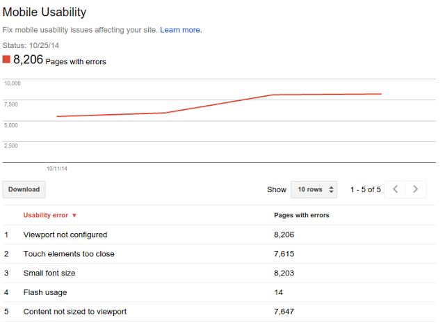
(from http://googlewebmastercentral.blogspot.com/2014/10/tracking-mobile-usability-in-webmaster.html)
Clicking on an issue will then provide a list of URLs on your site that need to be addressed. Let's look at each of the individual errors and what they mean:
Viewport-related Issues
Viewport Not Configured
This error simply means that the page is not set up to resize based on the device or browser window size. Regardless of the screen size, the page will be rendered at its full width, as if it were being viewed in a large desktop window. This is one of the fundamental aspects of Responsive Web Design, and it is the first step towards making a fully responsive site. Fortunately, it is also one of the easiest fixes to implement. This can be done by adding one line to the <head> section of the page:
<meta name="viewport" content="width=device-width, initial-scale=1">
This tells the browser that the page should be as wide as the device it is being viewed on, which eliminates the need to scroll left and right to view the entire page. As the device or browser window size increases, the page will become wider. It also instructs the browser not to zoom in or out as the device is rotated between portrait and landscape orientations.
Fixed-width Viewport
This is a related issue that essentially means the viewport has been configured, but the configuration was done improperly. Fixed-width viewports may allow a page to look good on certain devices, but they are not truly responsive or future-friendly. This is a less common error, but it is easily fixed with the same <meta> tag as above.
Content Not Sized to Viewport
This issue is the second part of the equation to making a website responsive. After configuring the viewport correctly, page content doesn’t automatically work well at all widths. For example, if the page has a banner image across the top, it will simply extend “off the screen” unless CSS rules are applied to make it resize to fit inside it’s parent element (such as img { max-width: 100%;}). Likewise, many pages have layouts created with explicitly defined dimensions that don’t “reflow” to fit the new page size.
This could potentially be one of the hardest issues to address, as it requires a completely different approach to page design that places content first (and can require a major overhaul of the page structure). However, through the use of Media Queries, different CSS rules can be applied at different page widths, which can often resolve some of the worst offenders. Solutions such as using percentage based widths, floating columns to “stack” content, or applying a max-width can often make a huge difference without needing to change any HTML markup at all.
Content-related Issues
Properly configuring the viewport and allowing content to adapt to any page width are major components to making a page appear correctly on all devices, but special consideration must be given to how content may appear on different devices.
Small Font Size
This error is informing us that on some devices, your content may be difficult to read. Generally, as the size of the device decreases, the size of the font should increase in order to allow for maximum visibility and legibility. There are a number of ways of defining font sizes, but on a smaller device, 16px is generally accepted as the minimum font size to use. In addition to being more legible, devices such as the iPhone will zoom in on a form element that uses a font size smaller than 16px. Elements such as page titles and headings should all be larger than 16px to ensure the page has a visual hierarchy, but 16px is the minimum for normal body content.
Google has a couple of extra recommendations that make sense, including ensuring that there is adequate spacing between lines of text, restricting the number of font faces and font sizes used on a page to reduce complexity. All of these aspects can be addressed through updated CSS rules, such as font-size and line-height.
Touch Elements Too Close
This error indicates that elements the user interacts with, such as links, input fields, and buttons, do not have enough spacing around them. Having too small of a “target” makes it difficult to select the desired item. Google looks for specific sizes of the targets themselves, as well as the spacing around them, to ensure they are easy to tap. This issue can also be entirely addressed via CSS rules, such as font-size, padding, and margin.
Flash Usage
This issue will be reported on any page that uses Adobe Flash content. Most mobile devices do not support Flash content, and it is quickly losing traction on desktop browsers as well--due to security vulnerabilities, Mozilla Firefox briefly blocked Flash content in July 2015. Most multimedia content, such as embedded YouTube videos, can now be delivered without Flash, so resolving this issue should just be a matter of updating content.
Designing for Every User
As the web becomes more accessible to people using an increasing number of devices, it is vital that pages appear correctly and content is easily consumable no matter how it is viewed. Addressing any issues found in the Google Webmaster Tools Mobile Usability reports will not only improve the experience for the end user, but will also positively impact Google search rankings.
Do you have any questions about mobile usability or how to ensure that your site is providing the best experience for every user, no matter what device or browser they are using? Please contact us to speak to a Solutions Engineer, and we'll not only help you address any issues you may have, but also work with you to create a website that will provide the best possible value for your and your users.
