In our connected world, users have come to expect websites to load very quickly. After just a few seconds of waiting, many users will abandon sites that don’t seem to be making any progress, regardless if they are on a hardwired PC or using a cell phone. There are numerous strategies to improve performance by optimizing server configuration, reducing file sizes, etc., and we have previously discussed strategies to improve perceived performance via inline critical CSS. Let’s take a look at how Skeleton Screens are used to enhance the user experience while pages are loading - without reducing the actual time they take to load. (No actual skeletons were harmed in this blog.)
You have likely seen skeleton screens in action without realizing it. Quite simply, they are content placeholders that are simple shapes filled with a solid color (or animated gradient) that are visible until the actual content has loaded. Various implementations of them can be seen across major websites like Google, Facebook, YouTube, Slack, Reddit and LinkedIn. They are an intermediary step in the loading process where the structure of the interface is created, but without requiring actual content – that is to say, they are the “bones” of the UI without any “meat” on them.
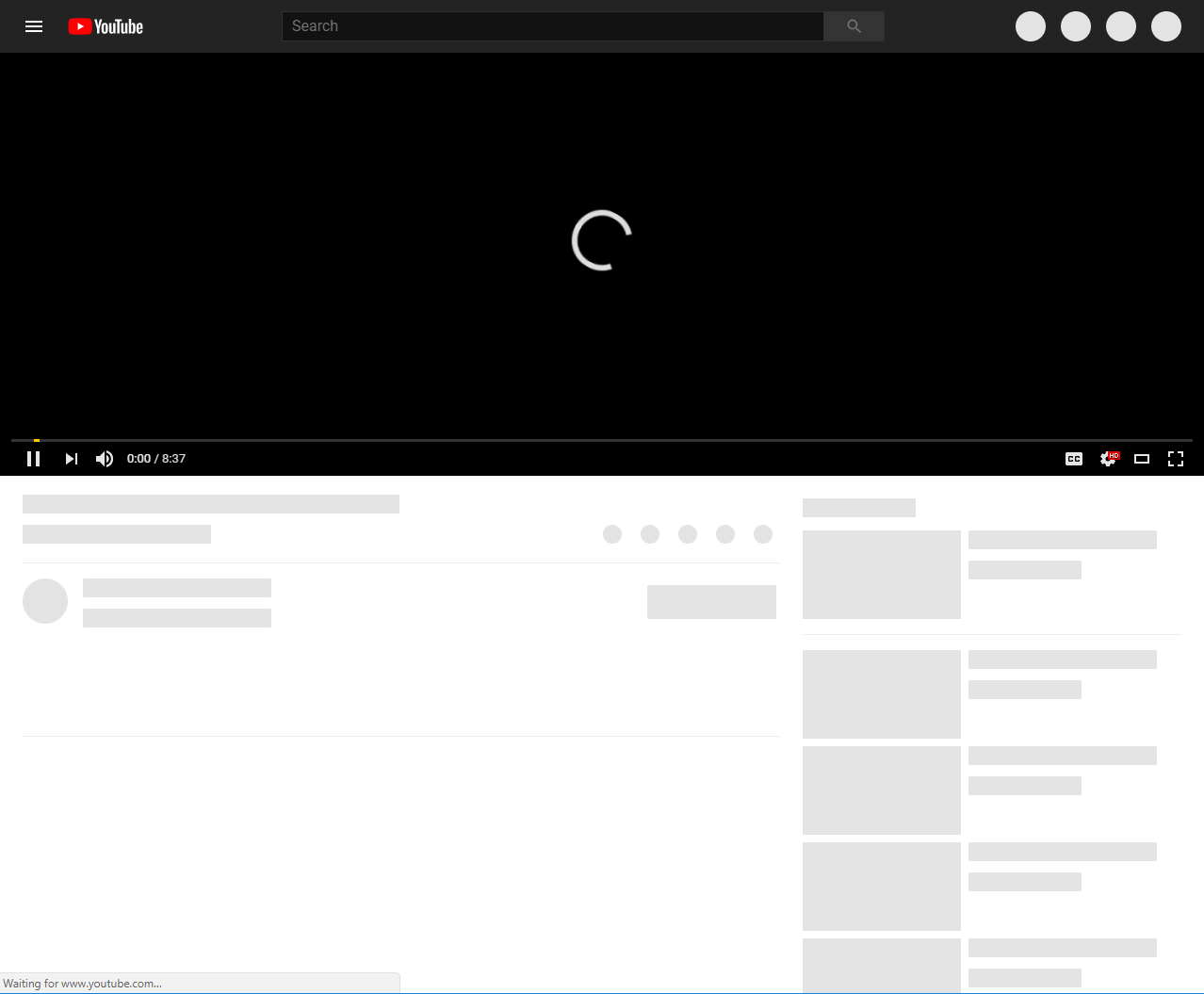
YouTube’s skeleton screen includes placeholders at the top right for user-specific actions, and below the main video for video details and related video content.
Skeleton screens reduce the perceived load time by informing the user of what interface to expect as early as possible in the loading process. As they outline the structure itself, they can be hard coded to appear while the server is still collecting and delivering all the page-specific content. Additionally, the user is provided with a sense of progression as the blank screen fills in with the skeleton and then the content, instead of just staring at a loading spinner or blank screen until the content is rendered.
The most difficult aspect of implementing skeleton screens is deciding what elements should have placeholders. Placeholders are most effective when they are used for UI elements that have a defined structure and predictable content lengths. Looking at the YouTube example, the placeholders provide a rough idea of what the UI will look like but aren’t attempting to create an exact 1:1 replication of the entire page.
Small circles that get replaced by icons of a known size (some with predictable text labels) are used for the user-specific actions as well as the video actions (like, share, etc.) and creator profile image. Rectangular placeholders are used for the video title, view count, user name, dateline, and subscription/notification actions, as well as related content image, title, and details because these are all text areas of predictable length. Since the content length in these elements can vary greatly, you’ll notice that there are not placeholders for the video description and comments.
Once the appropriate elements are identified, a few lines of simple CSS can be added to create the placeholders. The :empty pseudo-selector provides the magic by allowing the placeholder styles to be applied until JavaScript injects content into an element. Simply apply a background color and some reasonable dimensions to the empty elements that will receive content later, and your skeleton screens are well on their way. Here is an example of a media block with placeholders for the image, title, and teaser content:
A CSS transition on the background helps to smooth the transition as content is loaded, but otherwise, this is very simple CSS to just add a background color and approximate height and width to the elements. An animated gradient background could also be used to combine the benefits of the skeleton screen with a loading indicator if desired.
Skeleton screens help reduce surprise and disorientation as content loads, while simultaneously increasing the perceived performance of the page. At Diagram, we stay up-to-date with design trends to ensure the websites we build work effectively and are aesthetically beautiful. How have you used skeleton screens? Tell us below!
