When you’re looking to reach people through your marketing campaigns, you need to be able to stand out. It’s not enough to just create content and expect people to read it; you need to be able to design it in a way that’s attractive and appealing, encouraging people to read and share what you’ve created.
We’ve previously looked at some places where you can find great photos and how to choose the images that fit your marketing strategy, but today we’re looking at the topic from the standpoint of graphic design. How do you pick images that will work with the text you need to include (i.e. a social media banner, a brochure, or eBook cover design)? Using the following 4 tips, you’ll be able to choose the best images from a graphic design perspective in no time.
As an example, we found a stock image that is used in the ad below. Let’s dissect it and explore the things to keep in mind when choosing an image.
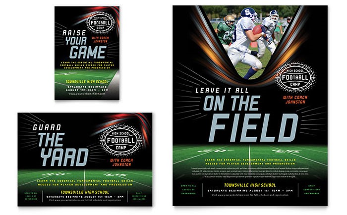
1. Think About Where the Text and Logo Will Fit in the Photo
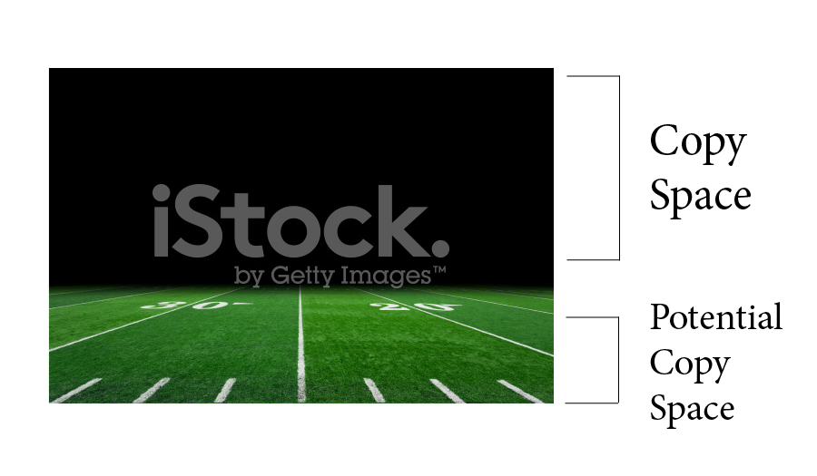
Take a look at the copy space in the photo. Copy space is all the empty areas within an image—that is, areas where text could be placed. How much text do you have, and how much of it will be included in the image? Depending on where the copy space is, you can align your text on the left, right, or center of the page.
If the image contains potential copy space, it means that you may have to make some slight photo editing adjustments in order to use this space. Using the example above, you can see that a black gradient was added so that the text would be more visible.
You’ll also need to be sure to consider where you will place your logo. If you have several color versions of your logo, which one will stand out and be the most legible against the photo you have chosen?
2. Find a Typeface That Will Enhance Your Photo
If you have a lot of text and not a lot of space, you probably won’t want to use a thick or wide font for all of your body text. HubSpot recommends using two different fonts in your marketing materials: one for your header, and one for body text. The standard rule of thumb is that no more than three fonts should be used on a document, since the design can start to look visually cluttered.
Want more information about pairing fonts? Check out this post by Canva for some great tips!
3. Consider the Versatility of Your Photo
As I discussed in my previous blog on choosing images from a marketer’s perspective, it’s important to consider the versatility of your photo. Is the image going to be placed on social network banners, in socials ads, or in email? Maybe in all three? Consider how the image will be need to be cropped to have maximum visual impact in a variety of mediums.
For example, take a look at the images we created for our eBook about content migration. For our social media banner, you can see that we cropped the photo differently than we did for the eBook cover in order to make the best use of the space. Is your photo as versatile?


4. Will the Photo Need Any Edits?
Will the colors in your photo need to be adjusted? Do any yellows need to be made whiter? As we mentioned above, our example ad uses a gradient that fades to black at the bottom of the image, providing more room for text (as we mentioned earlier, this is potential copy space). If you need to include a certain amount of text in your image, will you need to add more copy space, or do you just need to find a better photo?
Whether the image you choose will work for a one-time use or as part of a larger, multi-faceted marketing campaign, take care in selecting a photo that will fit the needs for your materials while highlighting your overall message.
Do you have any questions about choosing images or any tips of your own related to graphic design? Please feel free to share them in the comments below. We’d love to hear from you!
