What is Google Data Studio?
Back in 2016, Google Announced a new free tool that was based on their then paid beta version of Data Studio 360 called Google Data Studio. This is a tool for companies/agencies that allow for the creation of interactive dashboards and cross-platform reporting across more than 500 different data sources such as Google Analytics, Google Ads, Search Console. Fast forward about a year, and Google announced that it was making Google Data Studio Free for everyone, essentially meaning they no longer offered a paid 360 version. Another year later, their beta reporting tool was officially out of beta and released for general availability.
Why you should use Google Data Studio?
As mentioned previously, Google Data Studio can bring together your reporting across multiple platforms and tie all your data together in one place. There are many other reporting services out there that can do similar things but none that are as comprehensive and clean as Google Data Studio (plus, its Google so naturally all their products seem to mesh well together). Think of Google Data Studio as being able to provide comprehensive data reports that are living, breathing, real-time documents for everything from a monthly executive report to a day-to-day campaign reporting tool that can be utilized by not only internal employees but also clients. With Google Data Studio in your arsenal, you will be able to have a cost-effective (it’s free after all) solution for all your reporting needs across your organization/clients.
How do you use Google Data Studio?
Your Data Studio Dashboard
Upon accessing Google Data Studio, you are brought to your home dashboard. This is where all your reports and data sources can be accessed and created. When signing into Google Data Studio for the first time, there will be a report that is provided by Google that walks you through a tutorial of how to:
- Interact with reports
- Copy and edit existing reports
- Edit and add charts to your report
- Using date ranges and Filters
- Connecting to other data sources
- Different types of charts they have available
- Sharing your reports
- Tracking your reports using Google Analytics
- Using a Data Control in your report
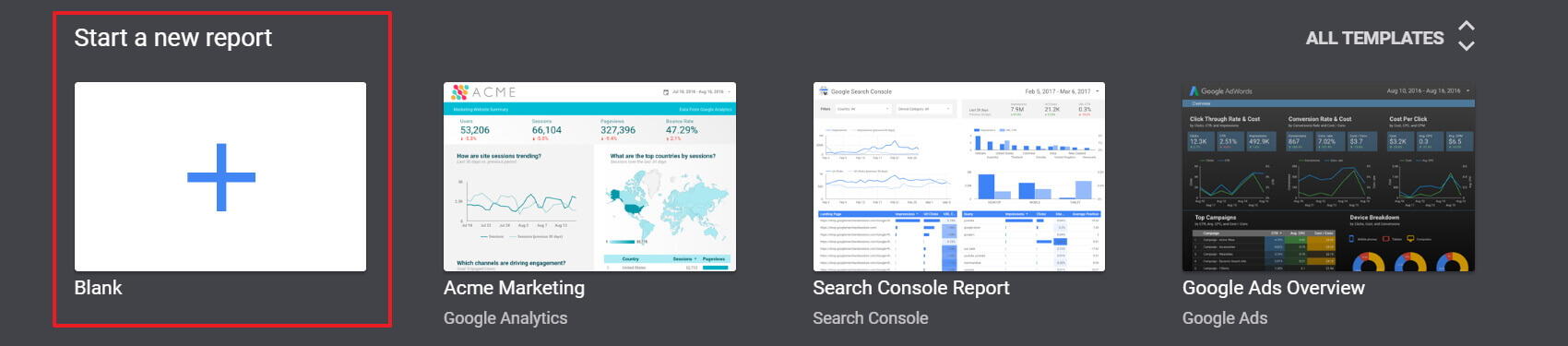
You’ll also notice a few templates at the top, in a carousel, that you can use to get your reporting started if you are unsure of what information you are looking to show or prefer to have a base template to start from. For the remainder of this article, we are going to be looking at what it's like when you are starting fresh with a blank report.

What should I do first, create the report or the data source?
Before any kind of report is created inside of Google Data Studio, the first step you should do is a little bit of pre-report prepping. This would include getting a list together of all the metrics you are looking to have shown in your report. This can be through something as simple as a Word Document or more on the collaboration side with others using a platform such as Basecamp. In some scenarios, you may already know what needs to be reported based on project specifics, SOW’s, or even from a simple note from executives asking for XYZ information. In other cases, you may simply be asked, “Can you report on the following campaign we ran?” In that scenario, some pre-report prepping will save you (and your sanity) hours of time.
Once we have our prep done, we can begin building our report. You can start this either way by creating your report first or your data sources, but we have found it’s more streamlined to start with the report first and from the report, simply create the data sources you require. Go ahead and click the big plus symbol in the carousel to create your report.
Don’t forget to also change the name of your report from “Untitled Report” to something more descriptive for your purposes in the top left.
Connecting to Data Sources
You should see your Data Sources Panel on the right-hand side of the new blank report. You can start adding new data sources by click on the “Create New Data Source” Button toward the bottom of the right panel. This will reveal the Data Sources selection screen. Here we can name our Data Source (if you don’t, it will be automatically named for you) and choose from two categories of connectors: Google Connectors (native Google Connections) and Partner Connectors (Connections built by 3rd parties). To use any of these connectors, simply hover over the box of the connector and click the “Select” bar. For this example, we’ll use the Google Analytics Connector.
When using these connectors, you will most likely need to authenticate with the services so you can grant Google Data Studio access to the information. Once authenticated, each connector has its own options that you would need to configure in order to pull your data as needed. Note: you will notice that in the 3rd party connectors, there are a lot of them made by the same companies. Some of these companies, such as Supermetrics, offer access to use all of their connectors for a certain price point. We personally use Supermetrics and have found them to be very easy to work with. Also, they have announced they are working on a HubSpot connector due to be released soon.
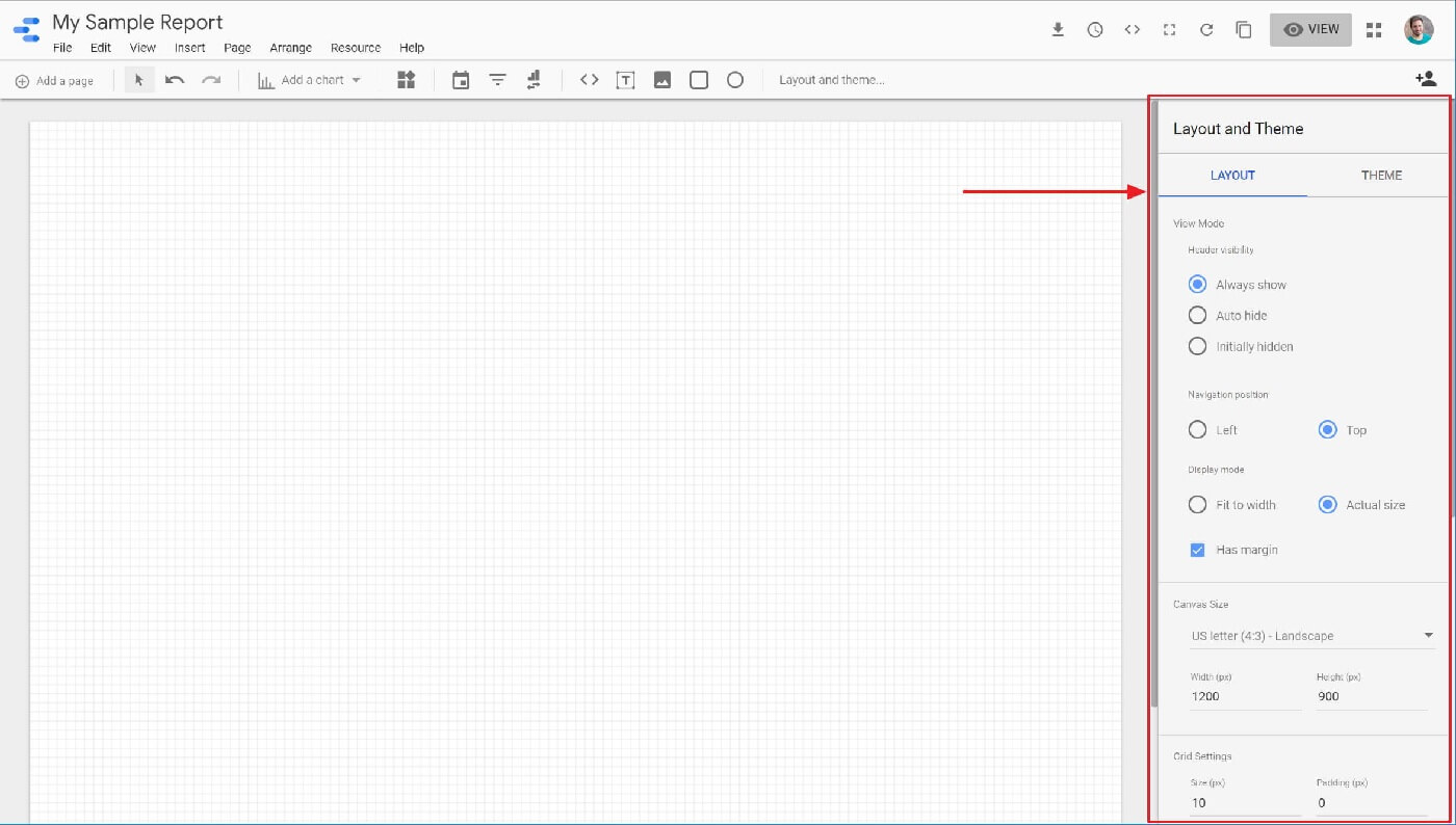
Layout and Theme properties
After adding our first data source, we will then see the report editor load up and our blank report ready to go (it should have a nice grid on it). One of the first things to look at is the right-hand panel of "Layout and Theme". This panel provides all the options for customizing the appearance and size of our report. Feel free to play around with the options as you desire, for this article, we’ll just keep all of our default settings as is.
Adding Controls to your report
With our Data Sources configured and our general template ready to go, we can now begin adding some controls and charts to our report to showcase our data. Controls and Charts can be added by one of two ways:
- The “Insert” menu located in the top navigation of the editor
- Using the buttons provided in the toolbar under the navigation
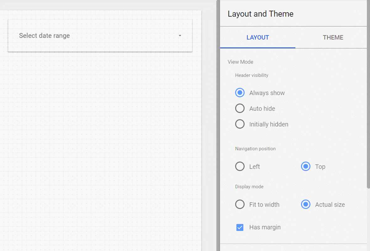
One control that is more common to add to your reports is the Date Range control. By clicking on the Date/Calendar Icon, we will see this control added to our report with the text “Select date range”. Using our properties pane on the right-hand side, we can adjust this controls default date range. There are many different date ranges you can assign automatically to the control or you can choose defined dates for yourself. For this example, we will select the “Last 30 Days” option and include today’s date for our Date Control.
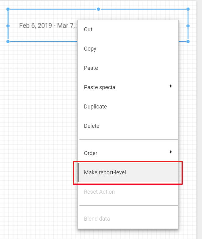
With this control on our report, all charts we add to this page will now be based on this date range. We also have the option to override this date range within each charts properties if we desire to do so. We can make our Date Range control consistent across all pages in our report by simply right-clicking on our date control and selecting “Make report-level”. This will apply our control across all report pages in the same location. Let’s do this now.
Adding Charts to your report
Now that we have our date filter control in place, we can begin adding our charts to show data for that range. For our report, we’ll add the following charts:
- Table
- Scorecard
- Time Series
A full list of chart types available in Data Studio can be accessed in the Data Studio Help Documentation > Chart References.
Adding a Table Chart
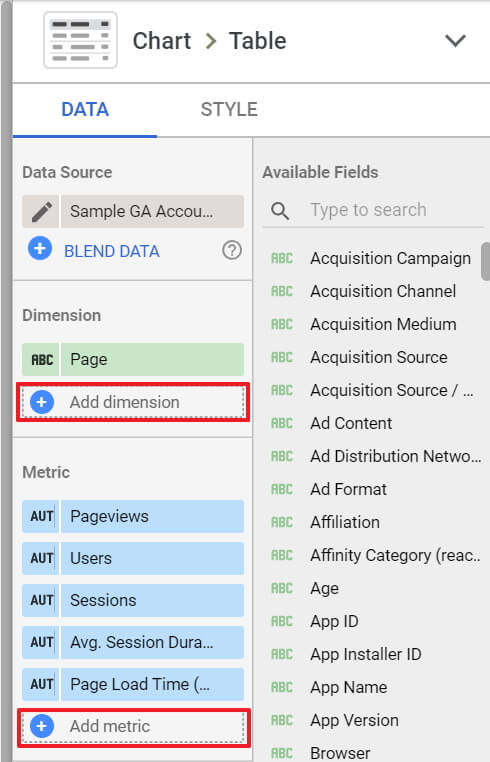
Using the “Add a chart” button lets go ahead and select our first chart under the Table category. After selection, Data Studio will drop your table onto the report and automatically choose dimensions and metrics for you. If you are not familiar with Dimensions vs Metrics, we recommend you read the Analytics Helps section on them in order to get a better understanding. For our example, we are going to show the client information as it pertains to their pages. For this, we can choose the following:
Dimensions:
- Page
Metrics:
- Pageviews
- Users
- Sessions
- Session Duration
- Page Load Time (ms)
You can add these items by clicking the “Add Dimension / Add Metric” buttons located under each section in the Data Tab of the right-hand pane.
While in this pane, you also have the ability to do the following modifications to your table chart.
- Blend your data source with another data source
- Control how many rows are shown on the chart
- Show a summary row of totals
- Assign primary and secondary sort fields
- Assign a custom date range (this will override our global date control if we use this)
- Show a comparison of this data vs an earlier period of time
- Add filters to your chart for when you only need to show a certain subset of your data
- Apply a Google Analytics Segment to your chart
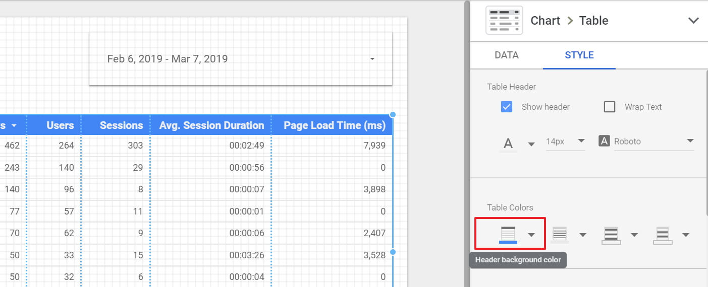
Each chart type you choose will share these common options (aside from the tables specific ones mentioning rows) for working with your data. Once we have our Data Tab options setup, we can switch over to the Style Tab where you will be able to customize the appearance of your charts (and even your controls). For basic or intracompany reporting, you might just leave the default styling in place. However, for client-side reporting, you might want to add a little pizazz and brand the report to your client's colors. To learn more about coloring your data, you can visit the Data Studio Help Documentation > Color Your Data.
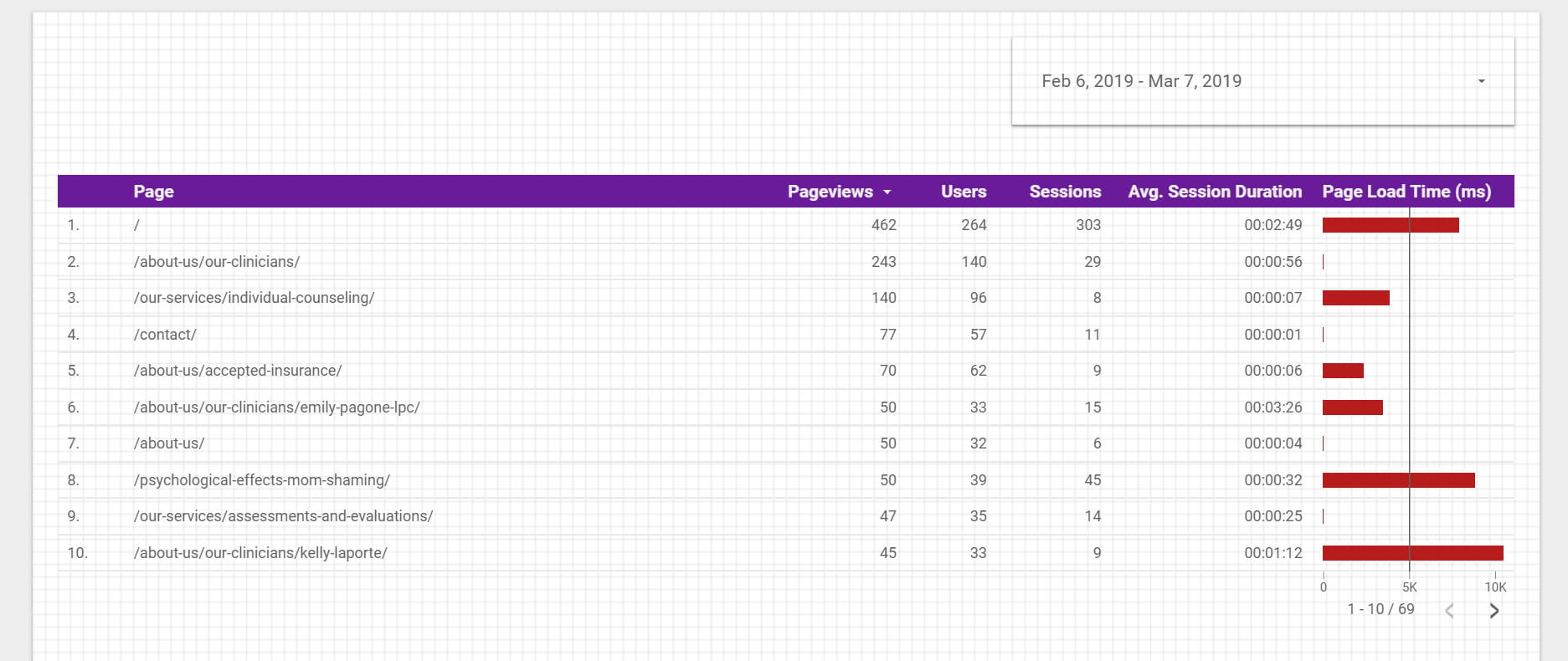
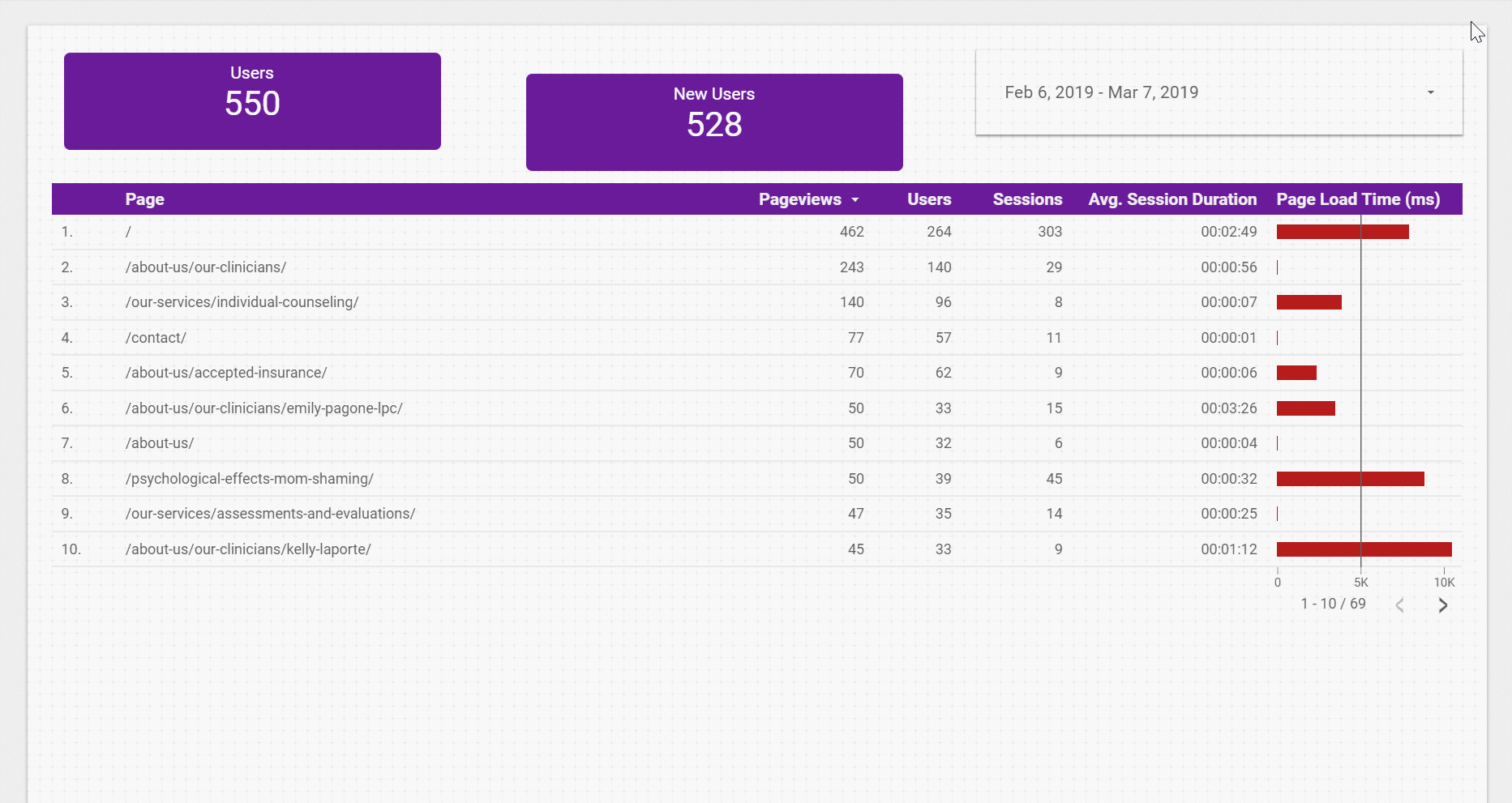
For the sake of this article, we are going to go ahead and some quick flair to our current table design. Let's start with changing the table header to match the clients branding. Simply click on our table, then choose the Style Tab > Table Colors > Header Background Color and choose the clients color of Purple.
We can see now that our table’s header went from the default blue to the purple color we have chosen. Now, let’s take it one step further and we’ll say we want to visually show our clients an indicator for page speed, so when pages take longer than 5000ms (5 seconds) to load. We can change the way some of the metric fields show on the table by using the Style Tab again. Under this tab, we’ll scroll down to the Columns section and look for Column #5 (remember, this is for the Metrics only, so we are counting metric columns, not total table columns). On the Column #5 Setting let's do the following:
- Change Number to Bar
- Change our Color from Blue to Red
- Enable Show Target
- Enter a Target Value of 5000
- We can leave the rest of the settings to the defaults that are there
We should now get a table that looks like the one below. This should be a good starting chart to our report for our client.
Adding a Scorecard Chart
A scorecard chart is a perfect way to show statistics for a single metric on our report. This is one of the easier charts to add and configure but can also be a powerful chart on the report as well as it can call out a single metric boldly.
Let's navigate back up to the top of our report and click the “Add a Chart” button and choose “Scorecard”. We’ll see the default metric that gets added is “Pageviews”. We can change this metric out by simply click on the Pageviews metric from our Data Tab and choosing another metric. Let’s go ahead and choose “Users” so we can show our client that they are getting more users to their site.
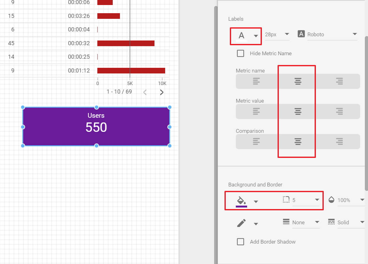
Perfect, it's looking good so far, but let’s go ahead and style this widget up a little so it looks branded as we did with the table. Hope back over to your “Style Tab” and let's do the following changes:
- Center align our values
- Make the background purple
- Round the Edges of the card
- Make our text white (so it doesn’t get drowned out by the purple)
In our styles tab, our changes can be made in two sections of Labels and Background and Border. We’ve gone ahead and highlighted the section to choose in our screenshot below:
We’re going to go about and move this scorecard to the top of our report above our table so we can fill the space more. Feel free to copy/paste this scorecard and use another metric to help fill in the rest of the top spacing, we’ve chosen to go with “New Users” for our copy. To make a copy, you can simply click on the element and use a copy/paste keyboard command or right click > copy, right-click paste as well.
One thing you might notice is after your done pasting your chart, you will need to do some additional layout adjustments to make sure the chart is lined up properly. You can quickly line items up with one another, as well as distribute them across the report, by selecting multiple items, right-clicking, and choosing one of the alignment options of Align Vertically, Align Horizontally, or Distribute. See below for quick use on this:
Adding a Time Series Chart
Next up, we’re going to add a line chart that is very similar to what we see when we are inside of Google Analytics, this is going to be the pageviews over time chart. To do this, we’ll go back to the “Add a Chart” button and choose the first chart in the Time Series section. By Default, your data will already be populated with Dimensions and Metrics. As we’ve explored before, let’s go into our Data Tab and adjust our Dimensions and Metrics to be as so:
- Time Dimension = Date
- Breakdown dimension = empty
- Metric = Pageviews
Then let’s quickly hop to our Styling Tab and set some options such as:
- Changing line color to Purple (for branding)
- Enabled Show Points
- Show Data Labels
- Show our axis titles
After all this, we can then resize our chart to the size of the page and we should end up with a chart like so:
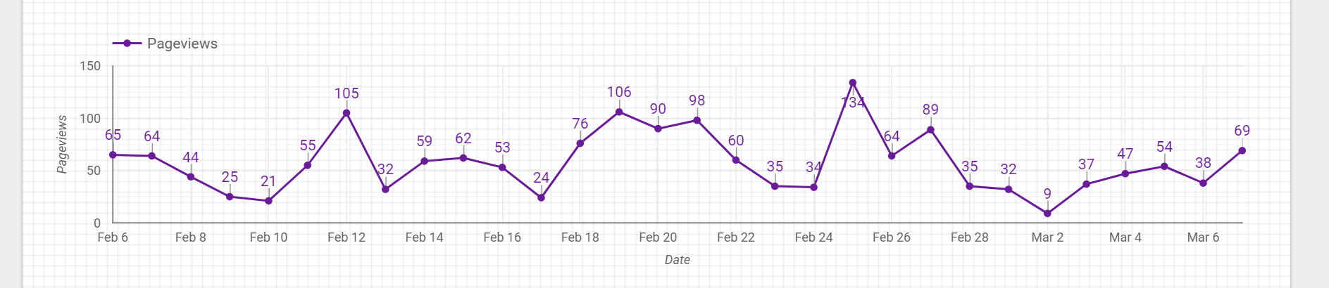
For those familiar with using Google Analytics, you will see this mimics the charts found in “Behavior > Site Content > All Pages“
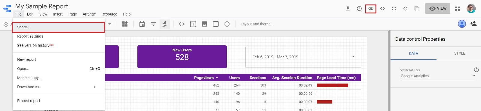
Sharing your Google Data Studio Report
Now that we have our report in a good spot, it’s ready for our client to begin viewing their statistics. Click the “Get Report Link” button or go to “File > Share”. From here you can set sharing access for the report as well get a shareable link.
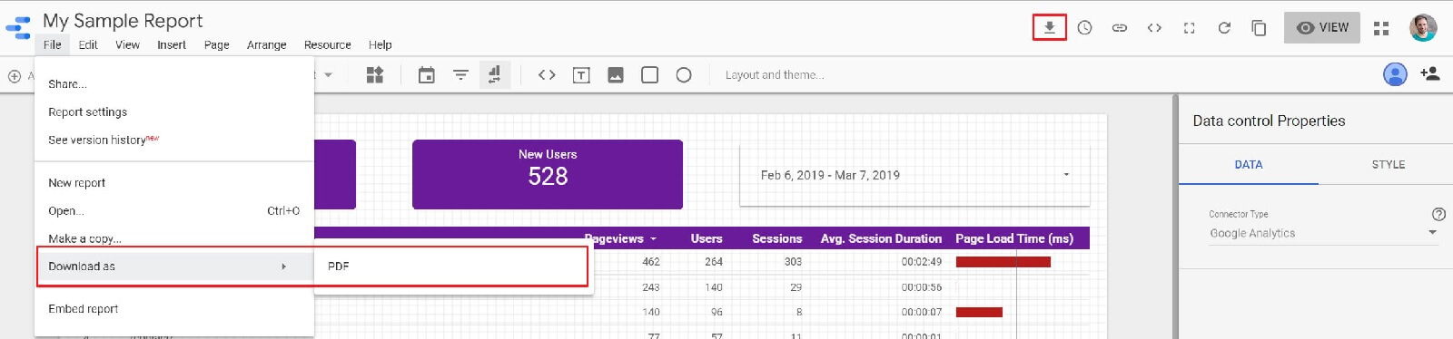
The choice on this is up to you and your client on how you want to provide them their data. If you don’t want to share an interactive report link, alternatively, you can click the “Download this report” button or use “File > Download as > PDF” and send them a physical copy of the report.
Did you know, you can also create one report that can be shared with many clients.
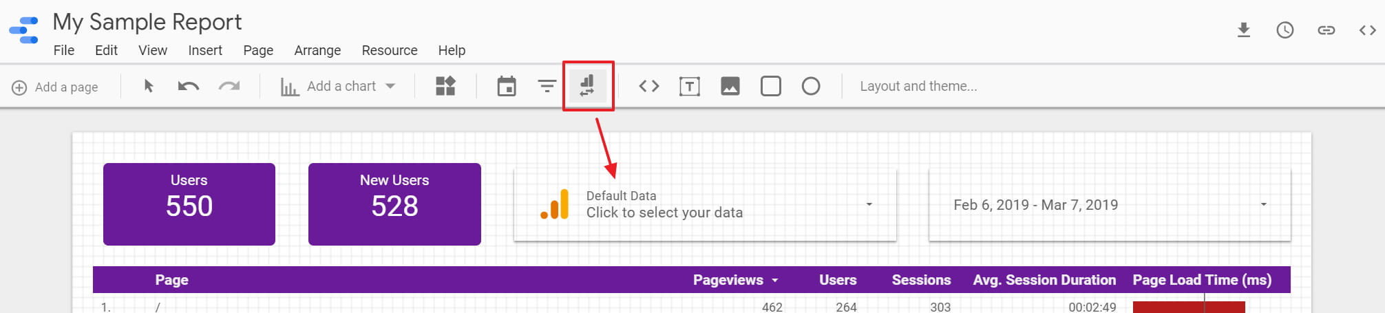
There is another control that we didn’t cover early on and that’s because it warrants its own section of explanation. This is the “Data Control” for your Google Data Studio reports. This control allows you to freely change out the assigned data source that can be used for the report.
You can create multiple Data Controls on a report and assign a Google Supplied Connector to them. When you then share your report link, individuals who are signed into Google will see their own properties listed in the Data Source Dropdowns. If they are not signed into Google, they will not see this widget and instead will be presented with the default data source supplied to the report. This makes it the perfect complement to our report if we have a client that has multiple brands/domains under its name.
To get a full understanding of this control, visit the Data Studio Help Documentation > Add a data control to a report.
Let’s recap what we’ve learned (TL;DR)
Overall, Google Data Studio is a very powerful reporting tool that has native integrations into almost all of Google’s products that they offer. It also has the ability to connect to additional 3rd party data sources such as Facebook, SEMRush, Moz, Twitter, Instagram and more through 3rd party connectors. For a free product, this is hands down one of the greatest reporting tools that you can use for your company to report on a client's digital analytics.
From this article alone we learned how to create a clean, data-driven, visually appealing report for a client without distractions. We added controls for filtering our data and a few charts that can be applied to our report showcasing the client's analytics. Coupling this with our Data Control, we are now able to provide a report for our clients that can be used across multiple website properties (and social properties if we use connectors) that the client owns. If you have any questions on using Data Studio, or maybe you’re looking for an agency to help with your analytics, make sure it drop us a line in the comments or reach out to us on our contact form and we’d be happy to work with you for your analytical reporting needs.
