A Progressive Enhancement Case Study: Power Orbs
Nick Melville#Design, #Responsive Design, #Design Advice

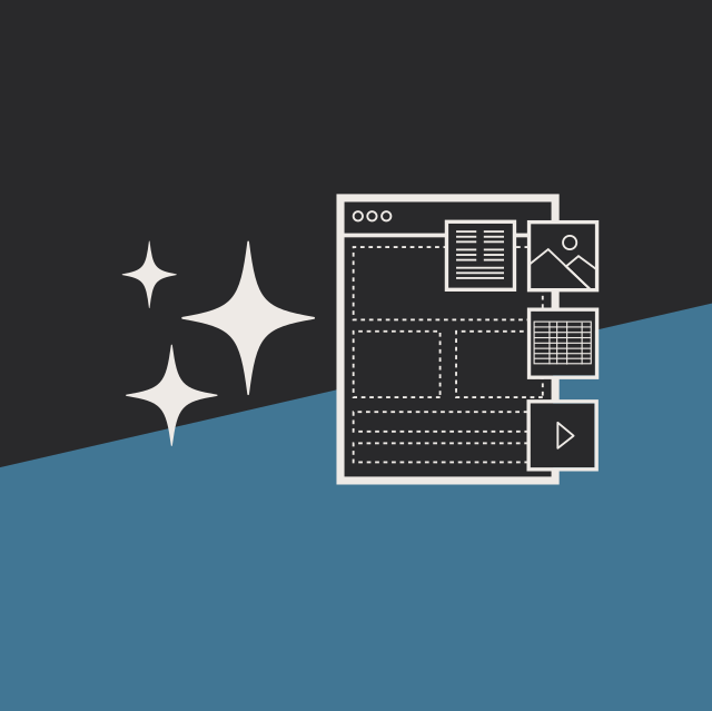
When developing websites for a variety of browsers and devices, there are two main techniques used to ensure that content is accessible to everyone and all users have a positive experience. Generally, we build our sites with the most common user in mind, and then adjust as needed for those with older browsers or more limited devices, or enhance the experience for those with cutting edge technology. These techniques are called Progressive Enhancement and Graceful Degradation, and the idea is simply to build a feature that works in standard browsers, but may appear or function slightly differently in various other browsers based on their capabilities.
One recent example of this involved an education website that has three main user roles: undergraduates, adult and graduate students, and online education. We wanted to heavily emphasize these roles on the homepage, so we came up with a design featuring large overlapping circles with teaser text and links for each role.

While this looks great in a modern browser on a desktop computer, what happens on a mobile device? And how can we make this stand out and provide a nicer experience for users with the best browsers? Let's take a look at the different ways this feature can be rendered, and then we'll explore the technical solutions required to make it work.
The Layouts
We developed three different layouts for this feature (which we nicknamed the "Power Orbs"); a small layout geared to smartphones, a medium layout suitable for tablets and small screens, and a large layout that most laptop and desktop users will see.
Most users seeing the small layout are likely accessing the website on their smartphone, so we know that space is at a premium. Rather than taking up a lot of space by stacking the orbs vertically, we decided to initially show just the title of each over the background image. When clicked or touched, the box expands to show the teaser text, overview button, and links (as shown). Notice that in this layout, the background image is always present, and there is no animation.

While this layout is appropriate for smaller devices, it doesn't work as well on tablet sized devices. However, the tablet screen size isn't large enough for all of the information that would be visible on the site to display at once, so instead, the medium layout shows each role with a title, overview button, and links. When you hover (or touch) the title of one of the orbs, the solid background color is replaced with an image, but otherwise nothing changes. In this layout, the orbs are set to automatically adjust their size to take up the entire width of the device or screen.

Finally, the large layout is what most traditional users will see on their laptop or desktop screens. Here, the orbs are a set size, displaying the title, teaser text, and overview button. When the user hovers over an orb, the background image replaces the solid color, the teaser text disappears and the button moves up, and the links appear below. In browsers that support it (IE 10, recent versions of Chrome, Safari, Firefox, Opera, etc.), all of these changes are animated, and the orb itself grows slightly in size.

Ultimately, no matter which browser the users are using on a wide array of devices, they should always be able to easily view one of these layouts and access the links they contain. The experience may be different based on how they access the website, but the user isn't punished for the device or browser they use.
Technical Details
While great effort went into developing the various layouts and experiences, the resulting code to make it work is actually fairly straightforward. The mobile layout is the simplest, with each orb being a div with display: block and a background-image applied. CSS rules display the teaser and links when the expand class is applied via a JavaScript listener (click) on each .orb.
On the medium layout, the orbs take shape via a media query breakpoint at 48em, and Modernizer tests for border-radius and opacity let us either render blocks similar to the mobile layout or the desired orbs (border-radius: 50% to create a circle) as supported. Their size dynamically responds to the width.1of the container to keep them roughly circular, and they are positioned absolutely to overlap each other. The teaser text is hidden at this point due to size constraints, which is the only piece of content that is not accessible at all times.
Moving to the large layout at 60em, the wrapper is centered, the .orb sizes are fixed at 310px, and the teaser text is added back in. When an orb is hovered over, there are a number of changes, and CSS transitions are used to animate them where supported. The orb grows in size to 330px while the margin reduces from 10px to 0px so as to not change the center point, and the background-image is applied. At the same time, the teaser text disappears by reducing both the opacity and the line-height to 0, which causes the overview button to move directly below the title. Finally, the UL containing the links appears as the opacity increases from 0 to 1. There are additional transition rules on the UL that delay the opacity change until the teaser text has completely disappeared (transition-delay: 0.25s) and make it more noticeable (transition: opacity 0.4s). To remove the UL immediately when the orb is "un-hovered", transition and transition-delay are set to 0 on the UL itself (and the above rules are actually on .orb:hover UL).
On top of these rules, using HTML conditional classes2, additional Modernizr tests (rgba, background-size, etc.), Respond.js,3 and fallback images, further CSS tweaks and overrides get the orbs working in a wide variety of browsers with a high degree of success and interactivity. Even without any CSS or JavaScript support, the content is perfectly accessible and consumable.
The Future
As browsers and devices continue to evolve and support new features, it is important to build websites that take advantage of their capabilities to enhance the user experience. However, it is also important to be mindful of users with more basic browsers, assistive technologies, or technologies that offer new methods of interaction like touchscreen PCs; you'll want to ensure that you support as many users as possible. Progressive Enhancement and Graceful Degradation are just two techniques we use to realize that goal. Please feel free to contact Diagram if you have any questions about these techniques or would like to find out how we can help you implement them on your site.
References
1. Creating Intrinsic Ratios for Video
2. Conditional Stylesheets vs CSS Hacks? Answer: Neither!
3. GitHub.com
Related Posts
User Onboarding Process: Guiding Visitors Through Your Website
We offer some tips on how to design a website in a way that helps users intuitively understand how to use it to accomplish their goals.

The Difference Between a CMS Migration and Website Redesign
Learn about the three areas website owners need to consider when planning a migration to Episerver: website design, CMS technology, and content.
Results Matter.
We design creative digital solutions that grow your business, strengthen your brand and engage your audience. Our team blends creativity with insights, analytics and technology to deliver beauty, function, accessibility and most of all, ROI. Do you have a project you want to discuss?

Like what you read?
Subscribe to our blog "Diagram Views" for the latest trends in web design, inbound marketing and mobile strategy.