When Bad Design Makes Sense
When elements of a design come together in harmony it feels like pure and total bliss. But as designers there are times when it’s our duty to work against our own intuition, and at the expense of our own bliss, because sometimes bad design decisions make good sense.
Refined color schemes, elegant typography, and meticulously arranged layouts are the pursuit of every designer. When elements of a design come together in harmony it feels like pure and total bliss. To the designer’s eye, when the principles that govern “good design” are abandoned, the offending work can produce a visceral repulsion. But as designers, there are times when it’s our duty to work against our own intuition and at the expense of our own bliss, because sometimes bad design decisions make good sense.
.jpg)
Intentional Dissonance
In music, harmony is achieved when notes are played in consonance. That is to say, the tones combine in a way which would be considered pleasing to most people. In interface design, this is can be achieved by means of things like typographic rhythm, relational color schemes, and adhering to a structural grid for layout. These elements all serve to help your visitor make sense of the items on screen, spend more time scanning and reading content, and create an overall positive impression. But just as with music, there’s more to a good song than soothing vibes alone. There are times when intentional dissonance enhances the experience.

Conflicting Colors
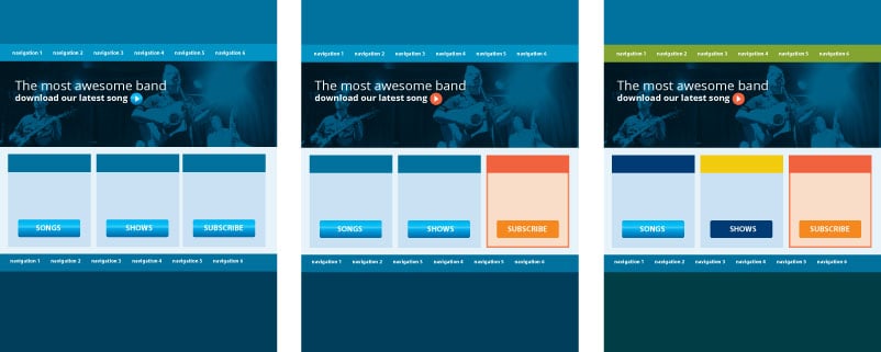
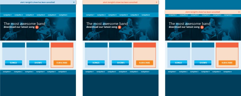
In music, melodic dissonance is created when notes of different pitch conflict, producing sounds that trigger feelings of tension or unrest. In web design, we can recreate this effect by introducing a color that conflicts with the base color scheme of a site’s content and chrome. This strong contrast produces visual distraction, which is ideal if you are trying to draw attention to a specific element on the screen—for example, a call to action or an alert.

Compositional Tension
Normally, we might seek to bring balance to the layout and establish visual hierarchy through the display of content. When you have an underlying system imposing order on your design, intentional deviations can be a powerful way to redirect attention, drawing a user's eye to specific page components. You can produce compositional tension by positioning object slightly out of place. For example, you could place two objects in closer-than-normal proximity, or arrange an element so that it awkwardly overlaps other elements on the screen.

Clean vs. Clutter
If you picture clean design, you probably imagine minimal content and ample whitespace. Indeed, whitespace is known to help pace how people consume information, creating a comfortable pace for scanning content on screen. From a graphic design standpoint, clutter would stand to mean too much information in too little space. Essentially: reduced density of information makes for a more readable design. Interestingly enough, field research by UIE revealed that when users refer to sites as being too cluttered, what they are responding to is not the design, but rather the content. It turned out that when pages contained lots of irrelevant content—even if well designed-users complained about the clutter. But in other scenarios, when lots of relevant links and information were packed densely onto the page, users miraculously had no complaints about clutter. This suggests that usability is not directly impacted by information density, provided the information presented is indeed relevant to the user. In these cases, content relevance may trump the benefits of “clean” design.
Usability vs. Good Taste
As a lifelong artist and designer, I would never challenge that notion that quote unquote “good design” produces positive impact, in both measurable and immeasurable ways. But in the world of interaction design, we must also must consider things like the cognitive biases of our users, the neuroscience of how people process information, and the ergonomics of device-use. There are times when usability and good taste collide. In those situations, it’s important that we take a step back, and, if need be, restrain our designerly tendencies, lest we become blinded by the lens of taste. It's also our responsibility to make sure that, tasteful or not, the design decisions we're making are indeed in the best interest of our customers and their users.
