Google Analytics is an incredibly versatile tool for tracking the activity on your website, but it contains so much data, figuring out where to start can sometimes be confusing. That’s where dashboards come in. They provide a customizable snapshot of your site’s data, giving you a quick look at what you need to know and allowing you to click through to more detailed reports.
As useful as these dashboards can be, setting them up can be tricky, so we’ve put together this step-by-step guide to doing so:
1. Create a New Dashboard
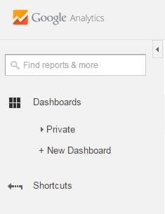
Dashboards can be accessed in the Google Analytics sidebar. Clicking on "Dashboards" will expand your options. From here, you can click “Private” to see any dashboards which have already been created (new Google Analytics accounts have a default dashboard installed called “My Dashboard"), or click “+ New Dashboard” to create a new one.
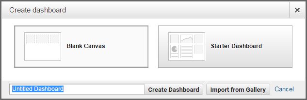
When creating a new dashboard, give it a descriptive name (such as "Monthly Reports") and choose either “blank canvas” or a starter dashboard. If you choose the latter, your new dashboard will contain a number of sample widgets which you may find useful, but for now, let’s choose “blank canvas” and start from scratch.
2. Create Widgets
After creating a new blank canvas dashboard, you’ll be prompted to create your first widget. Each dashboard can contain up to 12 widgets, and these can take the form of graphs, timelines, or miniature versions of reports.

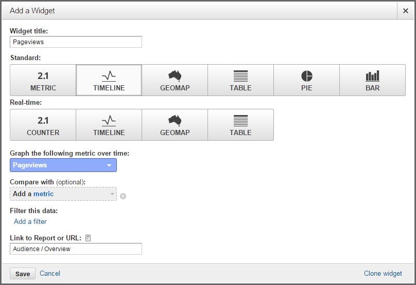
For our first widget, let’s create a timeline showing pageviews over time. Select the Timeline button in the row labeled "Standard" (dashboards can be created that track data in real time, but since most reports will view activity over a certain date range, we’ll use the standard view). Under “Graph the following metric over time”, select Pageviews. Under “Link to Report or URL”, you can choose which report the widget should link to when clicked, or the field can be left blank.
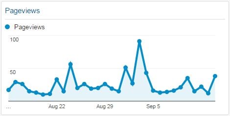
Clicking Save will result in a widget similar to this:
For timeline widgets, an additional metric (such as Sessions) can be added as a comparison, and filters can be applied to limit the data by options like country, browser, or referral source.
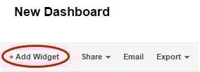
To create additional widgets, click “+ Add Widget” and select the options you want to use. See below for descriptions and examples of each type of widget.
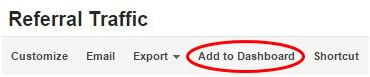
Widgets can also be added to a dashboard from any report within Google Analytics by clicking “Add to Dashboard”:
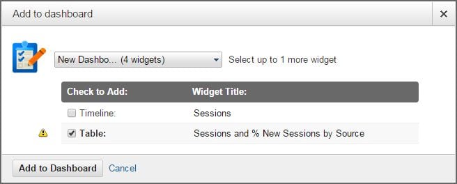
You can then select which dashboard to add the widget to, and you can choose to make the widget either a timeline or a table:
Once you’ve added it to your dashboard, you can then edit the widget change its type or select different options to display.
3. Organize Your Dashboard
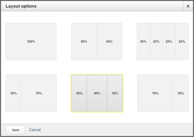
Widgets can be rearranged on your dashboard by dragging them to whatever location you prefer. If you want to delete a widget, click the X in the upper right corner of the widget. The number and width of the columns on your dashboard can be selected by clicking “Customize Dashboard” in the upper right corner of the screen and choosing your preferred layout:
4. Choose a Date Range
Once you’ve created and customized your dashboard, you can select the date range that you want to view by clicking the drop-down menu in the upper right corner of the screen:
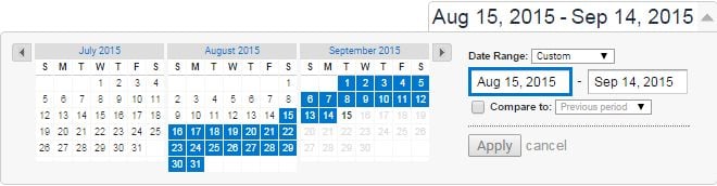
You can select any custom date range by clicking on a start date and end date on the calendar, by typing your selected dates into the relevant fields, or by selecting an option the last week, last month, or last 30 days from the drop-down menu next to “Date Range:”. If you select the check box next to “Compare to:” and choose a date range to compare your data to, each widget will display a second set of data, allowing for the comparison of two different time periods:
Types of Widgets
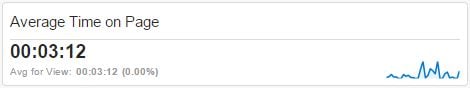
A Metric will display a simple number, such as average time on page or bounce rate during the selected time period. This can also be filtered to display only certain data, such as visitors from Facebook or people who found the site using organic search. Metric widgets will look similar to this:
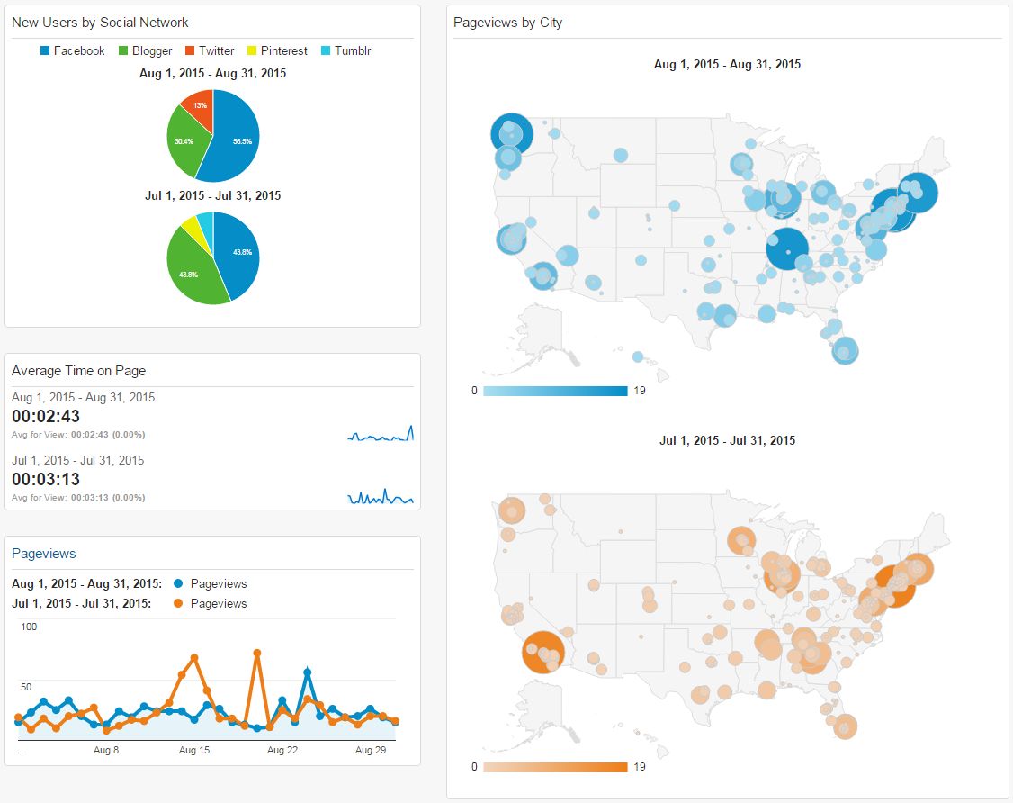
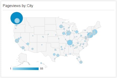
A Geomap widget will display a map highlighting a certain metric, such as pageviews or pages per session over the selected time period. You can choose to view this metric by country, region, or city, and you can display the entire world or limit your map to continents, sub continents, or individual countries. Here is an example of a geomap that displays pageviews by cities in the United States:
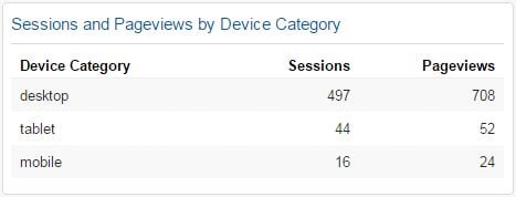
Tables display miniature versions of reports, allowing you to view a list of data, such as which device people use when viewing your site and the number of sessions and pageviews for each over the selected time period. The list can be limited to 5-10 rows, and up to two metrics can be selected for each row. Data can also be filtered to display only certain data, such as mobile users. Tables will look similar to this example:
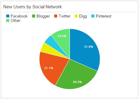
A Pie widget can display a pie chart of any metric over the selected time period. The number of “slices” can be limited to 2-6, and data can be filtered to display any subset of data. Here is an example pie chart showing the percentage of new users from different social networks:
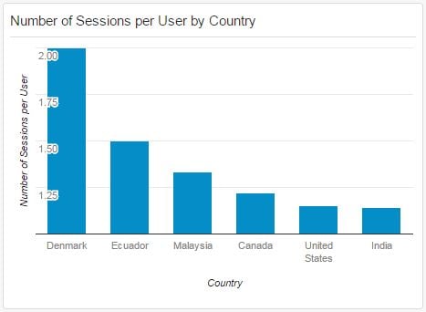
Bar widgets display a bar graph of any metric over the selected time period. Several options are available, such as whether to display the graph vertically or horizontally or whether to show the names and values of each axis. Data can be filtered to display any subset of information desired. Here is an example bar graph showing the number of sessions per user by country:
The Value of Dashboards
Now that you’ve set up your dashboard, you can use it as a starting point whenever you use Google Analytics to view your website’s traffic data. This snapshot of everything that is going on can be very valuable, and it can be a gateway to the deeper, more refined data that you want to delve into. As you continue to use Google Analytics, you may even decide to create a variety of different dashboards for different tasks, such as e-commerce or social media.
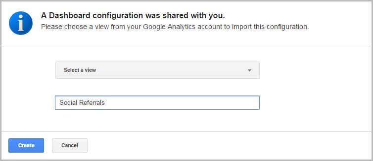
To help you get started, we wanted to share the basic dashboards that we use:
To import either of these dashboards into your Google Analytics account, simply click on the link or paste the URL into your browser. You will then be given the option to choose which Google Analytics view you want to import the dashboard into and the name you want to give the dashboard, and it will now be available to you!
Do you have any questions for us about Google Analytics dashboards or reports? Do you need help setting up Google Analytics or determining what data you should track as part of your digital strategy? Please contact us to speak to an online marketing expert, or feel free to share your own tips in the comments below!
