Modular Web Design: Designing With Components
Learn how utilizing modular design can increase design consistency, accommodate a wider variety of content, and streamline your workflow.
Align the image over to the left. A bit more. Now, up a smidge. Wait, nudge it back to the right just a hair and adjust the padding. Bump up the font-size by 2pt. Bold it. Okay, hit save—and voila! Another web page has been designed.
This process may ring familiar to many of you tasked with designing or producing web pages. Or, if you're facing limitations of the templates available in your content management system (CMS), perhaps you’ve been fighting for this kind of freedom to adjust elements, apply formatting, and control your individual page layouts.
Don’t be fooled, formatting freedom is not the web design panacea you might expect. If your overall goals are to increase design consistency, accommodate a wider variety of content, and streamline your workflow, you’ll find that the secret lies in modular, component based design. But before you get too excited, there’s a caveat: implementing modular web design means you may need to abandon the pursuit of formatting freedom (hint: this is a good thing).
Freedom and flexibility are not the same.
Freedom, as it pertains to the process of assembling web pages, implies the ability to make decisions based on individual judgment. Though we all crave the concept of freedom, it never seems to work in the best interests of the site. Freedom breeds design decisions that are based on particular instances of content and context. On a small sampling of pages, this might not be so bad. But as the number of uniquely art directed pages increases, or as additional content producers begin to impose their stylistic discretion, design standardization falls by the wayside. The result is pages that look good on their own, but lack any sense of cohesion as a whole and end up negatively impacting the site's user experience (UX).

Problems with free-form design
- Formatting that’s based on individual discretion rather than content structure leads to the inconsistent application of styles.
- Style that’s applied to elements within the content, rather than controlled globally, convolutes your content with inline HTML and CSS code. This can mess up how content is reused across your site, how it is rendered across different screen sizes, or how it can be adapted in the future.
- As the number of pages with custom layouts increases, the design appears more haphazard. This negatively impacts the user’s navigational flow and can create needless confusion.
The perks of flexible systems
A flexible system, on the other hand, implies that a site has been designed with enough foresight to handle diverse author needs and content requirements. Unlike tools that empower content authors to design their own pages and layouts, flexible design systems work by providing content authors with the ability to structure page content, select modules from a library of reusable components, and apply metadata which provides instructions for making dynamic content and template formatting decisions.
Gain Flexibility through Modular Design
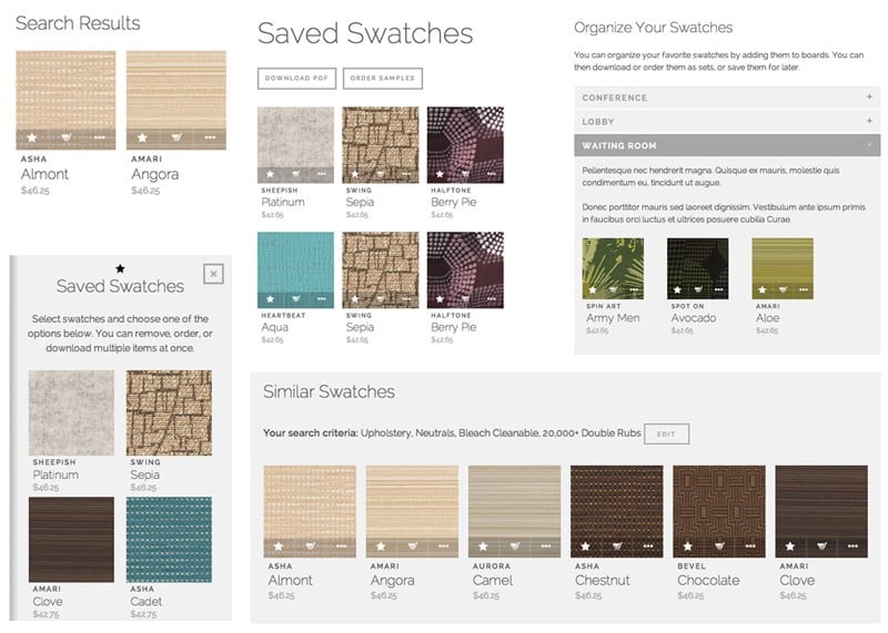
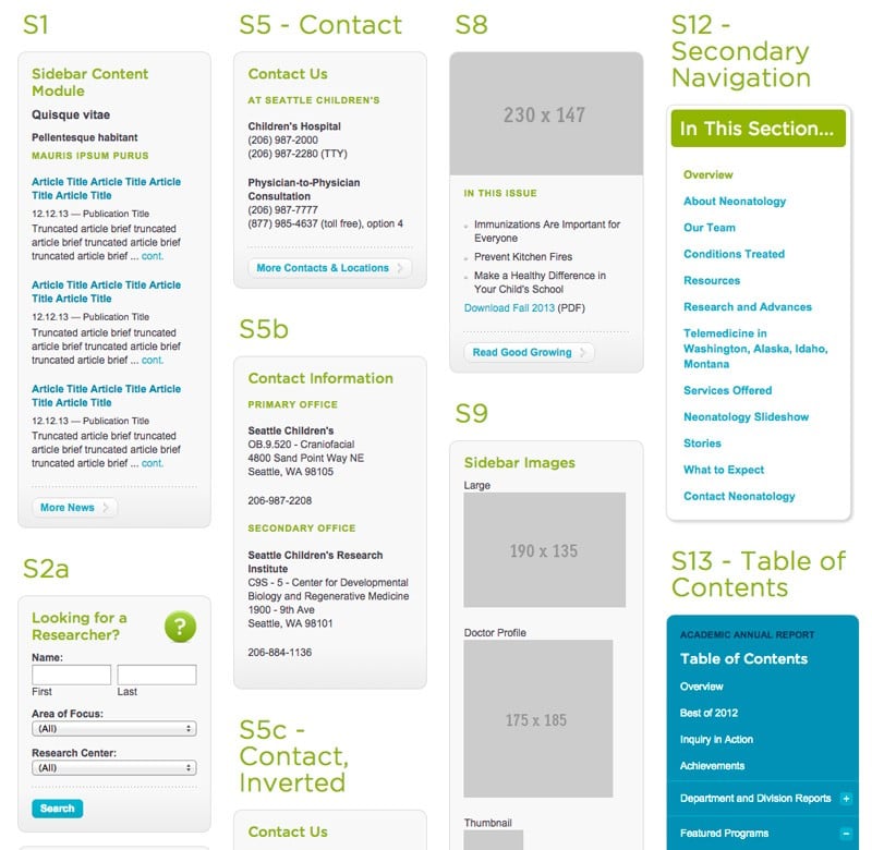
Modularity is the key to creating a flexible design system. For a system to be modular, it must have interchangeable parts. These parts are components. In Web terms, a component is just a generic term for any pre-defined object that you intend to use across multiple pages (you might also refer to these by another name, like widgets or modules). In order for components to be reusable, they must be standardized in appearance and function. This ensures that each component will render reliably regardless of the context it's used in. Think of components as Legos: interchangeable building blocks you can assemble into pages.

What makes a component modular?
- Standardized design: Its appearance is predetermined and doesn’t vary page by page.
- Standardized, centralized code: Unique code should not be needed each time you reuse the component.
- Controlled via system logic: Predefined formatting should occur based on system rules, not content author discretion.
- Customizable options: Display, content, and functional options should be controllable via metadata or other CMS content settings.
This may sound a bit abstract so far, so let’s walk through the process of modularizing components.
Modularizing your Design
Audit your existing elements and styles.
The first step is to get a handle on all the different building blocks your design is comprised of. The simplest way to do this is to comb through your site, page by page, and take screen grabs of elements that pop up in more than one place. Go through and sort them into categories of objects that are the same or similar.
Identify deviations, impose standardization.
If you’re the kind of person who likes to play “spot the difference” games, this is the fun (and eye opening) part. Review the items you’ve collected and try to find the various inconsistencies the exist among similar elements across the site. The more exhaustive your search the better. To find some of the common offenders, here are a few things to look for:
- How many different button styles and sizes are you using?
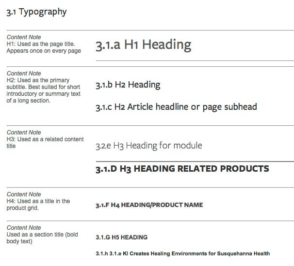
- How many variations (in color, size, font treatment) of headings are in use?
- Are similar types of content (like dates, bylines, icons, quotes) formatted the same everywhere?
- Do major components like hero banners, slideshows, thumbnails, and expandable panels always abide by the same aesthetic and function rules?

Eliminate discrepancies and boil each component down into a standardized model. Be deliberately lean, removing any page-specific component customization that doesn’t benefit the system as a whole. Pare down text styles and User Interface (UI) effects until you have a versatile, but limited, set of common elements to draw from.
Define and Document System Logic.
To make components reusable, they need rules. Without system logic defining how they can and should be used, we’d be back at freeform design. And be honest, do you really need the freedom to put tabbed panels inside your drop down menus?
Good component logic provides useful constraints. It can define:
- What variety of required and optional content the component must be capable of supporting.
- Where the CMS will and will not permit the user to use the component.
- What configurable options the content author will have access to that affect how the component will render.
Documenting component rules lead to more efficient UI and code. It can provide reference to content authors seeking to understand what components they have access to, and what the expectations and best practices of use are.

Modular Design Trumps Page Driven Design
In a traditional design process, you might work with a designer to develop a few critical pages for your site. You go back and forth as you discuss the pros and cons to every nuance of the UI, from content to interaction to layout. You end up with some great pages, as you might expect after collaborating for weeks or months with a team of professional designers. But what about the rest of the pages—the hundreds or thousands of other pages that make up your website?
While a page-design driven approach works great at a small scale, rarely do the decisions made for a few select pages map apples to apples to the needs of other site pages. Trying to force huge volumes of content into cookie cutter templates is much too limiting. And, on a large scale site, trying to go through and custom-design each page would be an unbearable undertaking. Short of a having a kick-ass internal design team with an excess of time their hands, this leaves site owners with few options. Usually, it results in site owners clamoring for more freedom to control page output, and burdening content authors (who may not have formal interaction design or programming experience) with the responsibility of art directing and DIY page building. It’s not the worst thing in the world—certainly no kittens will get harmed—but the reality is that if you wanted your content producers to design every page on the site, you could have just bought everyone copies of Dreamweaver (sorry, DW).
In modular web design, the quality of the pages produced is still important. It’s just that the focus of effort shifts away from agonizing over a handful of individual pages (at the expense of all the others) and toward a smart system of reusable design patterns, interchangeable components, and well-planned system logic. This leads to a more scalable infrastructure, better adherence to design standards, and content authors who are empowered to worry less about pushing pixels and focus on their core expertise: creating kick-ass content!
