You're the adventurous type. C'mon, don't be shy, you know you are. When you go to the deli for lunch or out to eat at a fancy restaurant, you're the one who actually pays attention to the daily specials. I can tell you exactly why you'd rather read the board or listen to the waiter, too. It's because you're open to alternatives, because finding a new favorite always makes for something to talk about.
It's hard to remember the days before Responsive Web Design, isn't it? For some of us, it's not that far in our rear-view, and for others, yet to come. As a UI designer, the biggest impact RWD had on me is what I produce for deliverables. You see, it didn't take me long to figure out that doing three full-page static comps in three different styles at three different widths got me nowhere fast when it came to using my time efficiently.
If you're anything like me, you had this ideal that you'd find the golden ticket of design processes on someone's blog the moment you became aware of RWD.
If you're anything like me, you had this ideal that you'd find the golden ticket of design processes on someone's blog the moment you became aware of RWD. While that may have worked for some, I'm still looking for it, and it's not because the existing ones are bad methods. Quite the contrary. There's some fantastic starting points for those of us still working at it (I have a feeling this is all of us, by the way). With a vertiable tasting menu of options out there, we've built our process by refining the ideas set forth freely by some awesome folks.
Baby Steps
The most logical place to start is by making a simple enhancement to static comps: adding basic interactivity. By placing a comp in a HTML document, you can make image maps of any buttons or links on the page, and string together your "Protocomps". It's an extremely simple task in Adobe Dreamweaver and I'd go in to more detail about Protocomps but I think they fall way short of what we're trying to accomplish. Their value might be if greater if we're just making sketches in Photoshop of individual elements, but if we're doing the full-page, static comp thing, we're still leaving out all the other possible sizes the site will be. Equally important, we're still producing way too much detail that could set us up to be sidetracked.
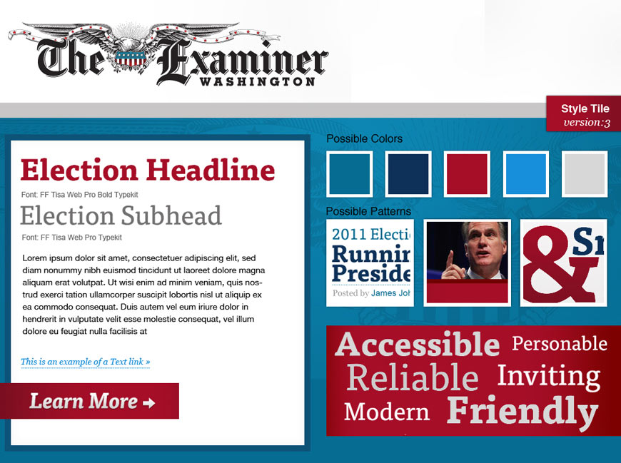
Stripped Down to the Tiles
Finally, an approach that meets the objective of isolating the style discussion from those of content and layout. Stile Tiles, in their purest form, are small compositions of type, color, buttons, and backgrounds that attempt to convey the look and feel of the site, without being applied to specific content and layout. For some, this approach works well, but I've found there to be a significant disconnect between the aforementioned tile and the understanding of how it will be applied. It's, perhaps, too isolated from the site, and requires another deliverable before the final product.
Let's Take It to the Browser
Out of Style Tiles come Style Prototypes, comparable in appearance but with heightened interactivity. In the traditional sense, the only difference is the medium of which it's built (an image editor like Photoshop for Style Tiles, the browser for Style Prototypes). The advantage the browser gives is the ability to resize and preview how elements adapt at different widths. The benefits of the two are similar, as are the disadvantages. Even when paired with an interactive wireframe, for some, it's hard to bridge the gap from a swatch of color to a block of text and images.
Style Prototypes 2.0
To recap, having the style discussion separate from specific content is objectively refreshing, yet has a drawback when it comes to envisioning application. I think there's a happy medium that needs to be achieved here, since retreating to doing full-page, static comps isn't ideal either. Let's step back a moment and consider why we're producing design deliverables in the first place...
Designers are tasked with creating the visual language for a site because it's integral to how the site is received by its audience. As a client, you'll want some assurance of what this language will be before giving the go-ahead to build your site, more or less. As a designer, you want to establish a system of design that alleviates the need for crafting the smaller details so early in the process, so that we can refine our broad strokes later on. The question remains: "how much is enough?".
The ubiquitous "design-y" answer to that question? It depends.
Of course it does. What works for one project (and the people associated with it) isn't always what works for another. Instead, what we've tried to focus on is "inferring the most through showing the least". This isn't a ploy to gain approval without doing an appropriate amount of work. It's a method of styling only those elements that are most important to communicating the overall look.
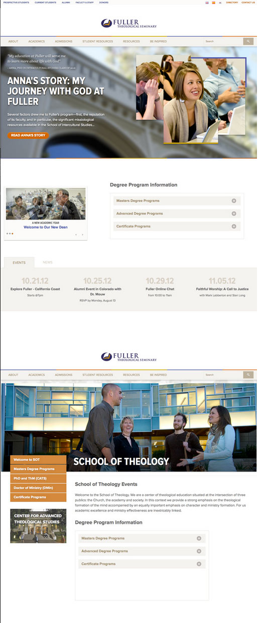
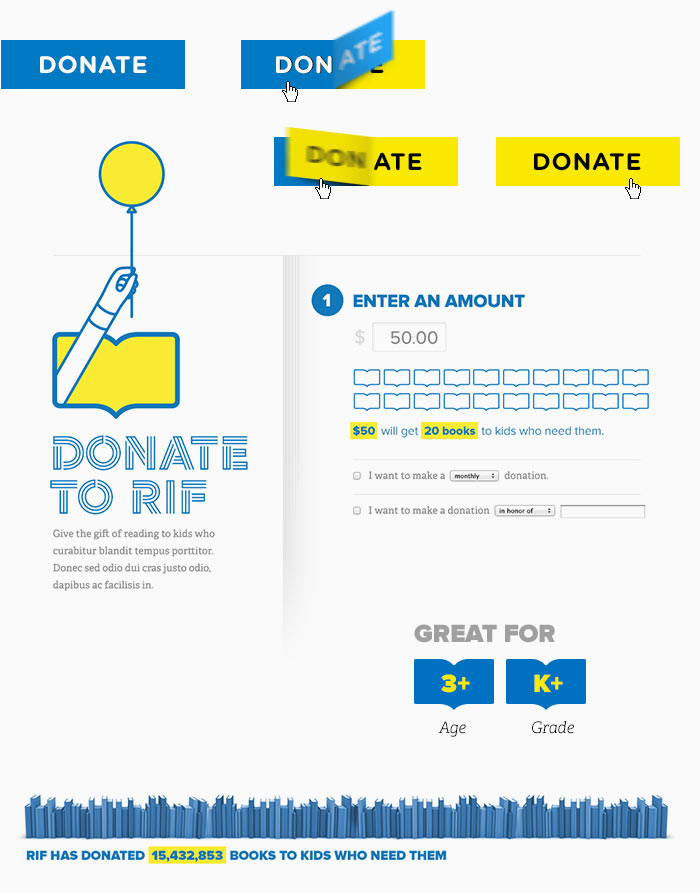
Typically, this would include header elements like the logo and utility navigation, the primary navigation, perhaps a banner or featured messaging area, and any unique modules or widgets like a location finder or profile snapshot. Like the more traditional Style Protoypes, our adaptation still lives in the browser, allowing the elements to be resized. You can see that if the amount of elements aren't limited, it's far too easy to approach the full-page zone, which is an incredible time investment.
Too often, as designers we leave the choice up to subjectivity without informing our clients how to make the most informed decision.
If you were a designer a few years back, you can probably identify with me when it comes to loathing multiple design comps. Making three different versions of something is an exercise that's hard to find value in (I always thought of it as "here's my best version and two that are subpar"). While I still cringe at the prospect of doing multiples for that reason, there is some value when the elements aren't that many. Too often, as designers we leave the choice up to subjectivity without informing our clients how to make the most informed decision. The question needs to become "what would resonate best with your audience?" and "how does this style attempt to achieve your goals?" rather than "what colors do you like better?".
Style Prototypes have gone over extremely well with our clients and seem to give us an fair amount of flexibility when it comes to making design decisions later with HTML/CSS prototypes (commonly deemed the "front-end development" of the process). Of course there's still room for improvement, potentially with the time it takes to make multiple styles, but as an approach it's more than adequate for the moment.
On the Horizon: Element Collages
If the time spent in the browser isn't making the process any easier (or quicker), it's perfectly acceptable to produce static comps of the primary elements. At first glance, this approach looks eerily similar to the full-page static comps we've been trying to avoid. However, Element Collages sidestep the details while implying responsive design with only a few different views necessary. Dan Mall details this process and the successes/failures he had openly. It's an incredibly appealing process for Photoshoppians like myself, and I'm sure we'll take a look at kicking its tires soon.
Here Today, Refined Tomorrow
The most important takeaway from all this should be that we're tackling the problem of designing for responsive web with a myriad of approaches. That's awesome. If someone were to dictate that there's a way that is superior to the others, it would have to be subjective because we have so many different skills, workflows, and general workplace environments that influence what approach we take. Consequently, there's undoubtedly dozens more approaches out in the wild as you read this.
Once you find a suitable process, continue to refine it and share your recipe with the world.
I'm thankful for those who have thrown out an approach like Style Tiles or Element Collages for the rest of us to taste, add seasoning, perhaps some hot sauce, and make our own. That's exactly what we're doing at WSOL. My advice to fellow designers is to be ready to turn your design process on its head and try a few of these methods out if you haven't already. If you're Photoshop-first, become browser-first, and vice versa. Better yet, once you find a suitable process, continue to refine it and share your recipe with the world. If we're still serving Style Prototypes 2.0 and haven't moved on to 5.7 or Element Collages 1.8 in a few months, you can bet we've gotten stagnant in our comfort zones. Adventurous types seek the new, not the old.
My advice to clients is as refreshing as it may be jarring: disregard any previous experiences of how a web design process took place, and the inherent expectations. Be ready to challenge your objectivity. These approaches aren't traditional, and that's a good thing. Neither is your new responsive website.
Banner Photo credit: avlxyz
