
The purpose of space
In layman’s terms, space typically refers to the area that exists in between objects in an area. In design, we refer to this, more specifically, as negative space (positive space is the area that is taken up by the objects themselves). In a design, negative space serves very important purposes, the first of which is to organize the interface into understandable pieces.
Space is used to visually group things.
Arranging separate objects in close proximity to one another suggests that they are related, leading them to be processed as a whole. Objects that are farther apart are perceived as being distinct from one another. Sensibly grouping similar objects together will help your users digest the information presented on the screen more efficiently.
“Organization makes a system of many appear fewer.”
Space dictates pace.
Consider how you might feel standing in the center of Times Square, versus if you were in the middle of the Great Plains. There is a direct connection between visual stimuli and emotional response. Studies have shown that when subjected to environments filled with distracting stimuli, people felt stressed and saw a reduction in attention span and memory. When our attention is directed and re-directed, "this alteration of focus can occur at a pace that leaves us mentally exhausted.1"

Back to designing for screens...
When space between objects is reduced to a minimum, more information is squeezed into view. More items in a single view means more information competing for attention, and as a result you decrease the likelihood that your users will focus on and retain what they see.
Through deliberate use of space, you can better control the pace at which your users are exposed to content.
In conversation we pause between ideas, using the silence between words and sentences to provide structure to what we’re saying. Think about whitespace in a design similarly, as a means of pausing (in some cases perhaps even dramatically) to help get your point across.
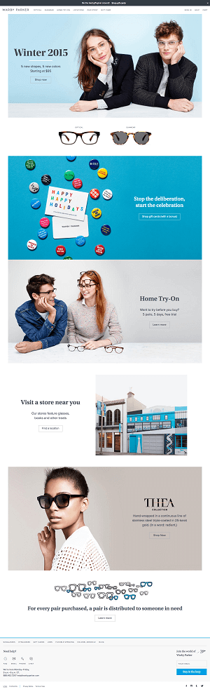
Warby Parker Example
To exemplify this, let’s do a case study style experiment using Warby Parker as our guinea pig:
The words used commonly used to describe the Warby Parker site include “clean,” “elegant,” “modern” and “stylish.” Regardless of the words you use to describe it, the site makes a positive impression on people. Beyond that, you can see how the space and scale of the site break up the information, so that it may be consumed at a leisurely pace—a scenic stroll, or scroll(?), if you will. It sets the stage for a user to savor the photos and actually read the messaging. It’s worth noting that this tone and casual ambiance aligns well with their brand overall.
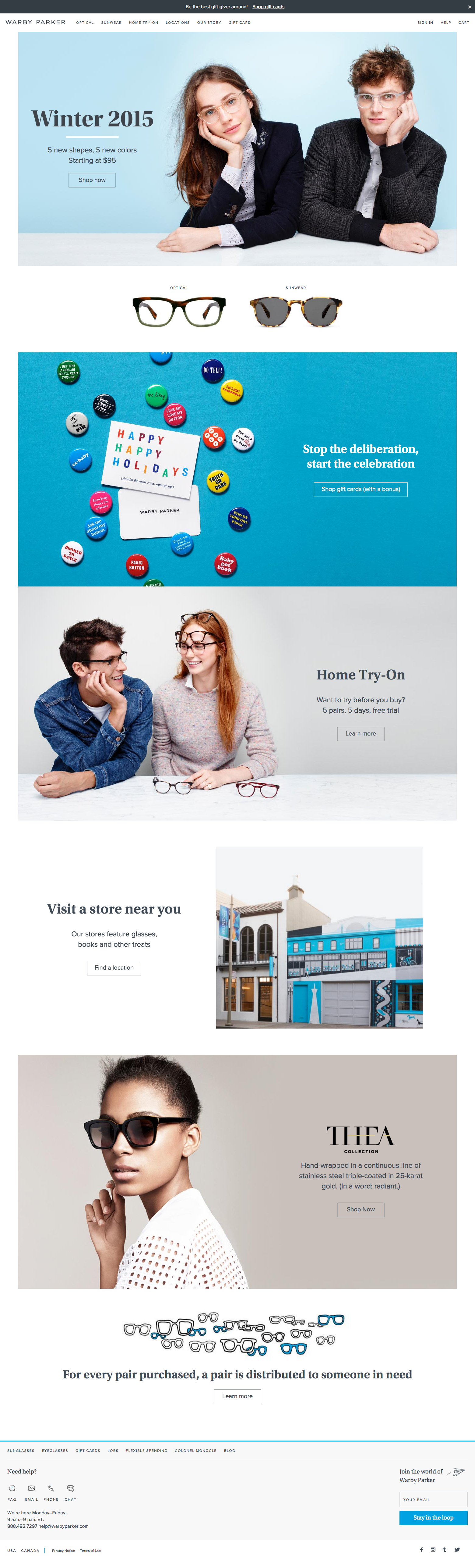
Warby Parker Example, Whitespace Stripped Out
In contrast, let’s look at the same design, this time with all “excess” whitespace removed.

In my experience, many website owners initially gravitate toward designs that generously utilize space. However, over the course of the design process, the open space becomes a point of contention, and sometimes even anxiety. The conversation may change based on the gut feeling that empty space equals wasted space, and that having content below the “fold” undermines the ability of the site to do its job.
Now, with all the glorious space removed, more copy and more imagery are all competing for attention at once. The scenic stroll has become a crowded city street. Your eyes dart around instead of peruse. You are more likely to survey the page for an indication of what's most important, than to read the copy. With space, the quality of the photography shines through. Cropped and tightened up, the images infringe upon one another, creating a distracting visual tension. The qualities that this design exudes now compete with, rather than align to, the whole Warby Parker vibe.
Spacing out!
Space should not be used simply for space’s sake. There are certainly cases where pages are too tall; where space is used recklessly and does not serve the overall design. The trap is trying to mimic the ways that other sites use space (or the lack of it) without pausing to understand the nature of how the use space can benefit or be a detriment to your design. Hopefully this post helps you make a more deliberate use of it!
References
- https://hms.harvard.edu/news/city-life-brain
- Photo credits: Justin Meissen, Big Rock Big Storm (CC license), MK Feeney Times Square, NYC (CC licence)
Related Posts

Breaking AI Paralysis: How Organizations Can Start Small and See Value Fast
Too many orgs stall on AI, fearing risk or chasing perfection. Here’s how to move fast, start small, and create real value — safely.

Pellet Smokers and the Natural Aversion to AI Among Experts
As an expert who's spent years getting good at doing hard things, how do you keep your expertise relevant when AI threatens to do the same work in seconds?
Results Matter.
We design creative digital solutions that grow your business, strengthen your brand and engage your audience. Our team blends creativity with insights, analytics and technology to deliver beauty, function, accessibility and most of all, ROI. Do you have a project you want to discuss?

Like what you read?
Subscribe to our blog "Diagram Views" for the latest trends in web design, inbound marketing and mobile strategy.