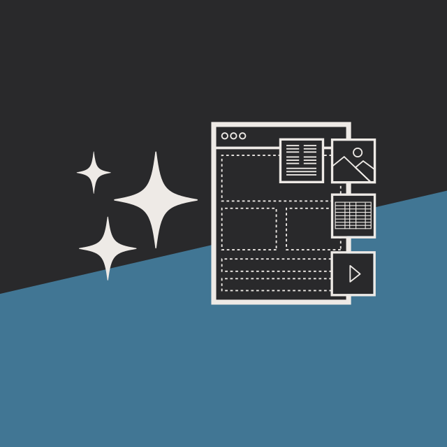
At Diagram, we recognize that Discovery is a key part of any website redesign, and one aspect of the process that is especially helpful is the creation of prototypes. Rather than spending hours discussing abstract design ideas, quickly mocking up new ideas and testing them out in a physical form is a great way to make sure the site will include everything in an intuitive and easy to use format.
These prototypes don’t have to be interactive designs made on a computer; in fact, we find that it’s best to start with a pencil and paper, making simple sketches of the redesigned site’s layout and all the elements that will be included. This is a great way to get immediate feedback from the client and work with them to improve on its functionality.
What About Mobile?
However, when we work with clients to create paper prototypes, we like to take things one step further and look at the site from a mobile-first perspective. To do so, we use a paper cutout the size of a smartphone screen, and a long strip of paper to represent the mobile version of the website. The cutout can be used to see what will be visible to the user as they scroll up and down while viewing the website.
This method is a great way to get people out of the desktop mindset and think about what is truly important on their site. With space at a premium on small screens, it becomes extremely important to determine what they want their users to see first and what people will need to scroll down to see.
Why Mobile-First?
While some organizations create a separate version of their website for mobile users, this is not an experience we pursue at Diagram. When sites are created in this manner, some of the content that is available on the desktop version of the site is often missing on the mobile site. As more and more people use mobile devices as their primary method of accessing websites, this means that these people will never experience the full version of the site.
In order to ensure that a site provides the best possible experience for every user, we believe it is best to look at the mobile experience first and then consider how to expand the design to larger screens. This also lets us consider the site’s content strategy, defining the hierarchy of the site’s information and determining what message is being conveyed to its users.
Our method of paper prototyping from a mobile-first perspective is an excellent way to help a site’s owners understand what is important on their site, how people will use it, and how to create the best possible experience for every user. Do you want to know more about how we create prototypes, how our other Discovery can help you learn how people use your website, or how our website design process can bring you success in your digital strategy? Please contact us to speak with a Solutions Engineer; we look forward to working with you to create the best possible online experience for your users!