Structuring Navigation for Higher Education Websites
Managing the website for a higher education institution can be challenging when trying to meet the needs of diverse audiences. Start your site off right with the proper navigation for your audience.
If you manage the website for a higher education institution, you've undoubtedly felt the pain of trying to negotiate priorities and balance the needs of diverse audiences. A typical university is expected to provide online resources for a variety of groups, including:
- past students (alumni)
- current students
- prospective students
- faculty and staff
- friends and donors
- affiliated community groups
Each group has unique reasons for visiting the site and different goals they're trying to accomplish. For example, a prospective student may be trying to decide whether or not to apply, and so is in search of compelling information that will help her figure out whether the school will be an academic and cultural fit. But to a current student all of this content might just get in the way of their hunt for the academic calendar and curriculum requirements. Both groups, however, may benefit from seeing the course catalog: content which is less important for alumni and donors.
The dilemma where some content is audience-specific and other content is shared can make building out your navigation seem overly complicated. But if you follow some existing conventions and best practices you'll see that it's not all that bad. Before planning out your navigation, consider the following basic rules of thumb:
- Don't duplicate links. Placing links to the same page under multiple menus will only confuse users. People will have an easier time navigating when they have fewer options and when links follow a logical categorical convention.
- Choose straightforward, mutually exclusive navigation labels. People do best when there is little to no conceptual overlap between menu categories. Ambiguous labeling will stall your users as they deliberate between options.
- Visually prioritize your menus. You want your main navigation to attract focus, and so should be the most prominent set of links in your template. Secondary navigation should take a back seat. And auxiliary/utility navigation should be most discreet.
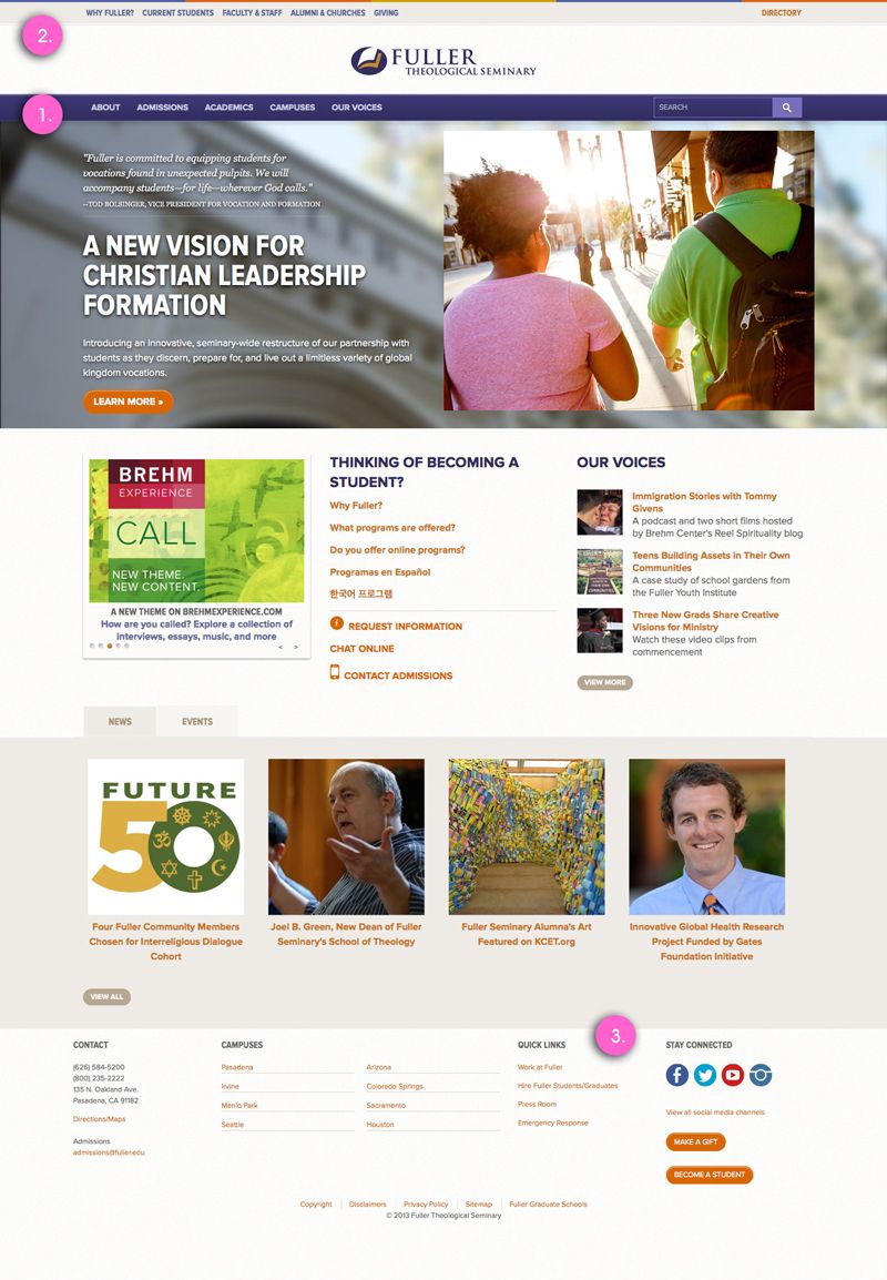
With those rules of thumbs in place, let's look at a common navigation model effectively used by many higher education websites. This model segregates links into separate menus, each with a specific purpose. As you work through the navigation on your site, consider how you might sort your links into each of the following menus.
Structural Navigation
When designing your primary navigation, categorize content by topic or subject matter. Any site visitor looking at your main navigation should have a good sense of what content can be found where, regardless of which audience type they are. When planning your main navigation, use terms you know your audience is familiar with and categorize content in a way that makes sense to them. Avoid modelling your content categories off of your institutions's departmental structure, since it's unlikely to make a lot of sense to people outside of your institution.

Role Based Navigation
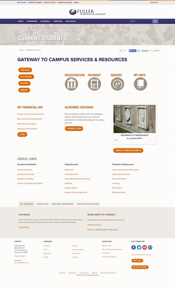
Categorizing content by audience type is tempting, but avoid using audience types as your primary means of organizing content. This requires your site visitors to self-identify with a specific group in order to browse content. This creates confusion when a site visitor doesn't fall strictly within one of the specified roles or if they aren't familiar enough with the groups to anticipate what content will exist in each section. That said, role-based navigation can still come in handy as a means of routing people to high demand content. A good way to use role based navigation is as a supplement to topic-based structural navigation. In this model, structural navigation defines the sites content categorization and hierarchy while role based navigation directs users to audience-specific landing pages: curated pages that aggregate links to the most salacious content for each group. This permits each content item to reside in its proper categorical section (as organized within the main navigation), while still providing your target audiences with convenient place to access the content most relevant to them.

Global Utility Navigation
Utility navigation is a menu of links that relate to the operation of the site itself, or to frequently accessed tools and resources that exist outside the boundaries of the public-facing site. Examples might include: student portal log-in, library site, job board and so on. The links here generally benefit from being exposed globally across the site, but are usually downplayed visually so as not to compete with the primary content and main navigation.

Call to action navigation
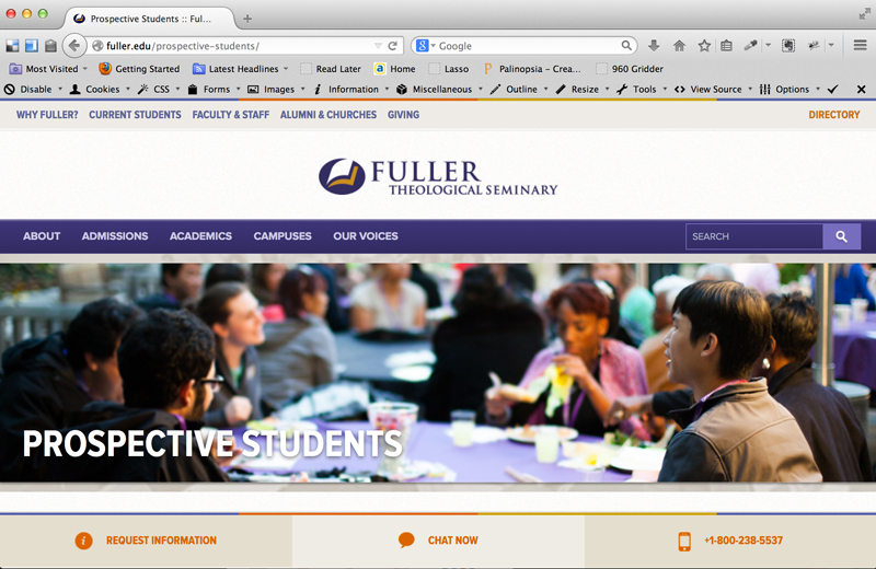
An effective .edu site will nudge site visitors toward taking specific actions. These might be universal call to actions like: request information, schedule a tour, or apply now. Or they might be context specific, for example, revealing a "make a charitable gift" button on pages intended to appeal to donors. In either case, when you have a specific action you want your users to take, you're likely to have better success drawing attention to those actions by presenting them separately on your page rather than clumping them in with your structural or utility navigation.

Getting there
The incredible scope of information that higher education websites are responsible for publishing makes for a daunting amount of content to organize. Combine this with the pressure exerted by different internal factions and stakeholders vying to meet their individual business goals, and coming up with a solid Information Architecture can seem like a lost cause. The trick to getting started can be to wrangle up and evaluate the various menus currently in play on your site. Do you have more or less menus than you need? Ask whether each follows basic rules of thumb, and whether it has a clearly defined model/purpose. With a good system in place, you'll be much better equipped to sort through your content, and build out a logical, user-friendly site map.
