Surely you've heard of accessibility -- be it the WCAG or Section 508 variety -- right? If not, I would like to recommend a post on this blog from our Design Director, Dennis Kardys. It's an important read for anyone involved in web design, whether you are working on the back end or front end, are a content editor, or are overseeing a migration project with no fingers in the programming mix whatsoever.
As there are different approaches to accessibility, I'd like to share steps you can take to make your site as accessible as possible in terms of your content. Even though we work mainly with the Episerver CMS platform, these ideas can be applied to any CMS. If you'd like tips on how to optimize websites designed within Episerver, our Lead QA Engineer Kendall Smith has some for you.
One quote from Dennis' blog that stood out to me reads:
Web Accessibility is not about ticking off a box in a requirements document, or abiding by legal constraints. It’s about making things that are useful and usable for everyone.
With that in mind, buckle up! We're heading into Accessibility Hyperspace!

Be on the lookout for...
Here are some common accessibility issues for which you can easily plan, with a little critical thinking:
Heading Structure
Use heading tags to indicate sections and subsections that are related. Clearly identify with H tags (H1, H2, H3...) instead of just bolding your text and increasing/decreasing font size.
Would you like an example? Check out this blog post! H1 for the title of the page, H2 for the two main sections, and H3 for the related sub-sections. Here at Diagram, we practice what we preach!
Lists, Lists, and More Lists
Build numbered or bulleted lists using OL (ordered/numbered list), UL (unordered/bulleted list), and LI (list item) tags instead of asterisks, hyphens, manually typed numbers, or other symbols as bullets.
Below is a no-no way to list the standings for the NHL Western Conference Central Division (as of January 3, 2019):
1. St. Louis Blues
2. Colorado Avalanche
3. Dallas Stars
4. Winnipeg Jets
5. Minnesota Wild
6. Nashville Predators
7. Chicago Blackhawks (Ouch! Yes, I'm a Blackhawks fan.)
This is bad. Very bad. Try using OL (since this is an example of a ordered list) and LI tags instead of P tags and typed numbers and then use CSS to style the list to your taste.
- St. Louis Blues
- Colorado Avalanche
- Dallas Stars
- Winnipeg Jets
- Minnesota Wild
- Nashville Predators
- Chicago Blackhawks (Last place hurts even with compliant code.)
While it may not look too terribly different, to a screen reader and the person using that assistive technology, it makes a world of difference.
Avoid Generic Page Titles
Don't fall into the trap of coding your page templates with a generic page title that contains just your organization's name in the title bar. Page titles should be unique relative to the rest of the pages on your site but descriptive enough to get the point across while being less than 60 total characters in length, for SEO (and you thought keeping below 140 characters in Twitter was tough). Sticking to these guidelines will keep your page distinguishable from the rest of your site but still optimizes it for search engines. Oh, and the page title should come before your site name.
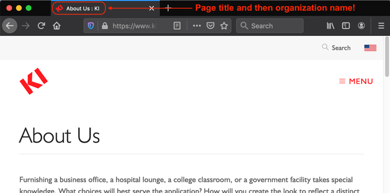
With our clients, we prefer to set the page title base and separator in the site settings within Episerver. Then, when you create a new page, the page title you give it is appended with that separator (the colon in the image above) and page title base (company name) automagically.
Use Image Alt Text
One of the oldest remediation tips in the accessibility book is image alt text. Just remember to add that description to your images when you upload them to Episerver (or whatever CMS you use) and you're good to go! Oh, and make them human-level English, not a name that has indecipherable abbreviations and long alpha-numeric strings. If it's a picture of Han Solo and Chewbacca going into Hyperspace, title it "Han and Chewie Into Hyperspace." This not only makes it easier for those using assistive technology to know what is on the page, but it becomes much easier to find the image in Episerver should you need it again. Don't forget, there is SEO value for the alt text for images too!
Avoid Generic Link Text
Back in the day it was all too acceptable to use text such as "more info" or "click here" as the hyperlink to other pages either on your own site or somewhere else in the Interwebs.
These days, this is no longer the case. For one thing, it's just very weird to read. From an accessibility perspective, it lacks any sort of descriptive base for a screen reader to tell you what the link is or where it goes. If you don't hyperlink more accommodating text, a screen reader will actually say "Click here contains a link to h-t-t-p-colon-backslash-backslash-w-w-w-dot..." Would you want to be on the receiving end of that message? Me neither. If someone using a screen reader knows ahead of time where the link is going, they can click it before the URL is read aloud or skip past it entirely.
Be more descriptive about your hyperlinked text or build the link into the existing text on the page. See the next section for a couple examples.
Compare Your Contrast
Contrast is a tricky one for web developers. Everyone loves to play with colors and see what hues complement others for background colors, normal text, hyperlinked text, visited text, etc. A lot of time can be invested in this research.
Well, at the same time, you should also be looking into contrast ratios for those with sight issues. Have you ever looked at a website that was grey text on a black background? I have and even with my relatively decent eyesight, it was a horrible experience that made me never come back to the website again. But at least I had a choice. Many people do not.
To this end, I highly recommend using an app such as HueGo Lite app for MacOS or Instant Eyedropper for Windows to sample both foreground and background colors on your website and then plug the hexadecimal codes into a service such as WebAIM Color Contrast Checker to determine if they meet WCAG standards. Of course, if you already know the hexadecimal codes because you have access to the stylesheets, that will save you a download.
Check Your Stuff...
Here are some online resources that will check individual pages or entire websites against WCAG and/or 508 standards:
WAVE by WebAIM
If WAVE is an acronym, I have yet to figure out what it means. But that doesn't make it any less handy for checking your site for accessibility issues. Just plug in the URL of your page on the WAVE site, sit back, and wait for the results. This service tests for form labels, heading structure, alt text, keyboard-friendly navigation, contrast, and so much more!
WCAG 2.0 AA Report
The Bureau of Internet Accessibility (BOIA) offers a free service to check your entire site against WCAG 2.0 A/AA checkpoints.
SortSite
PowerMapper offers the free SortSite service to check your entire website for compliance against:
- WCAG 2.0 - 118 tests covering A, AA and AAA guidelines
- WCAG 1.0 - 86 tests covering A, AA and AAA guidelines
- Section 508 - 55 tests covering 15 guidelines
Siteimprove Accessibility Checker
First a disclaimer, Siteimprove is paid SAAS (Software-as-a-Service). However I had access to it for a couple years at my previous job and found it to be incredibly useful. What makes it better is you can request a free trial to see what kind of checkpoints and errors are returned to you to determine if the service is worth the money they charge.
In Conclusion...
While this may create a little extra work for you and other editors on your website, think about all the goodwill you will garner with a community of people that tend to be criminally underserved. In the case of government or educational websites, techniques such as this are mandated from on high. This is not the case with other types of sites like retail. But that doesn't mean that the visual and hearing impaired populations may not have a need for the data on your site.
So take a little extra time and future proof your site now. Plus, as you become accustomed to thinking about accessibility standards, the easier they will become to implement.
More information
For additional tips and information, check out:
- "How to Create Section 508 Compliant Content in Episerver." Diagram: 2019 March 5.
- "Identifying Web Accessibility Issues." The National Center on Disability and Access to Education (NCDAE).
- "The Most Common Web Accessibility Issues to Avoid." Bureau of Internet Accessibility: 2017 November 3.
