There’s been a lot of talk within the industry about how, as web designers, we should focus on designing systems of components rather than pages1, and how taking a modular, component driven approach to design is key.
The idea behind modular design is that designing sites page by page is impractical. By nature, websites are ever-changing. Content refreshes frequently, and pages are continually added and removed. Even when sharing the same underlying template, a page’s dynamic content and individual content requirements will result in some degree of dissimilarity between pages. Producing a design mockup for every possible page and page variation is simply not sustainable. It creates wasted effort and defeats the point of using a content management system (CMS). When designing one page at a time, even the most rigorously attentive teams are bound to introduce slight deviations from one page to the next.
Taking a Modular Design Approach
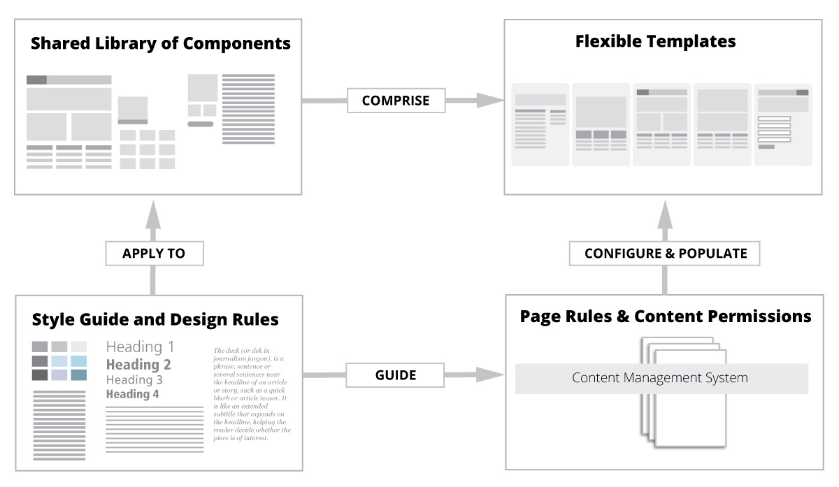
The antidote to this is to discard the page-centric model of design, and to instead focus on designing a system—a modular set of components capable of being combined in many different ways to create templates and pages2. By providing your clients or Web producers with a well-planned set of building blocks, you give them greater flexibility and the ability to quickly produce new pages, while maintaining design consistency and code scalability (designing pages and components ad-hoc can result in ever-expanding CSS files and bloated, inefficient code).
Transitioning away from page-centric design
Developing and maintaining a robust design system can be an incredible challenge. But if you want to take your first steps to being more systematic and less page-centric, there's a relatively low barrier of entry to get started:
-
Audit your interface to increase standardization.
Spend time digging around your site, capturing screenshots of all the different elements used throughout. Document the different fonts and font-sizes in play and wrangle up all the versions of buttons, form fields, icons, thumbnails, banners, and all the other objects used across your sites. These building blocks are your design components. Review what you’ve collected, identifying all the discrepancies. Find components that are slightly different (but don't need to be) and develop a single, standardized version. -
Standardize your code and adopt conventions.
Look for inefficient code like duplicative CSS or inconsistent markup. Standardize naming conventions, organize your CSS, and refactor code to be more modular and object oriented. -
Document and share your standards.
Make it as easy as possible for others to reference, use, and contribute to your design and code standards. Create documentation that shows how design components should be used. You might include things like HTML hex codes for colors, typographic details, or which pieces of the component are optional versus required. Try to capture all the possible permutations for each design component.
Organizing, centralizing, and documenting the components that make up your site is a great way to lay the foundation for a design system. But the effort you put into wrangling this all together won’t pay off if it only amounts to documenting a one time inventory of your site's components. Evolving from a library of standardized design elements to a full-fledged design system requires some additional work. Here are some principles that can help you plan out a more complete design system:
-
Delineate your system boundaries.
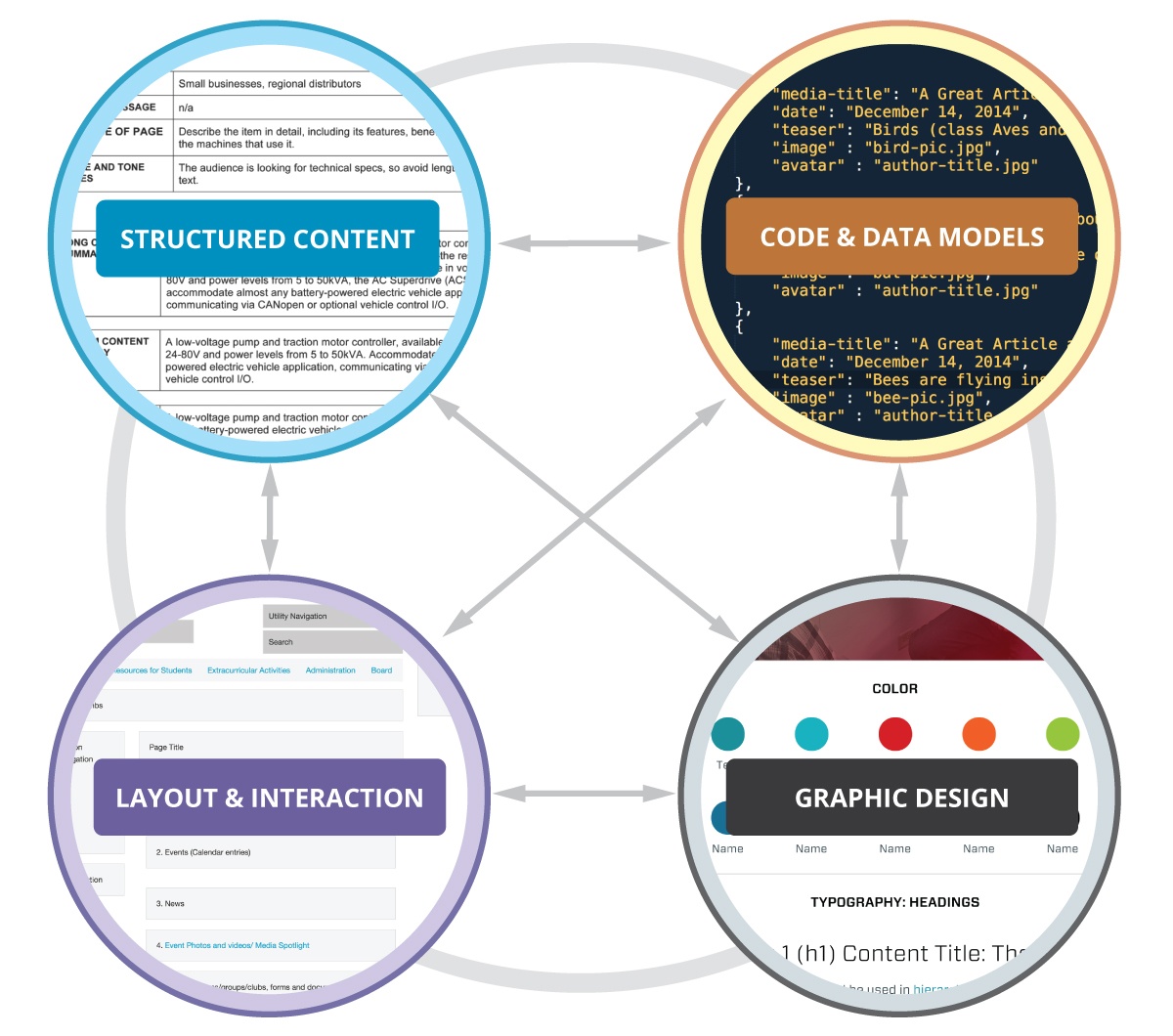
By definition, a system is a set of interacting or independent components that form an integrated whole. Your system needs clear boundaries so that you can determine what to include or exclude from it. For example, does your system only encompass conventions for a single website? Or will it be shared among multiple sites managed by your organization? Some design systems are intended to set conventions that cross digital platforms (web and native applications). Still others are meant to be pervasive across channels (digital, print, physical environments). -
Systems should be “living”.
To keep design and code in sync, your system should have self-sustaining qualities. If changes are made to an individual template or component, those changes should immediately be reflected across the system. All instances of the component, including its documentation, should be updated automatically. -
Provide flexibility, not freedom.
Lego blocks are commonly used as a metaphor to explain the concept of modular design. While modularity is a good thing, not every component is designed to be used in any way imaginable. If web producers are permitted to assemble components and pages in any fashion they please, it could lead to increased disorder and chaos. -
Develop system rules.
For order (rather than disorder) to increase over time, your system will need basic rules that outline how it can be used. For each component or template you’ve identified, are there requirements for use that make sense to define? For example, if you have a “call to action” component that will be reused across your site, ask:- Are there any content elements within that component that are required? Optional?
- Are there any contextual rules (i.e. zones of a page) that this component must be used in? Or restricted from being used in?
- Are there technical restrictions in place for something like image size? Or editorial guidelines for copy writing?
-
Bake system thinking into the entire design process.
Too often, a front end developer is handed design specifications and expected to retroactively impose system order upon it. Even the most meticulous design is bound to incorporate some arbitrary elements. Structure yourworkflow so that system-thinking occurs at every stage of the process.
The development of a design system cannot rest squarely on the shoulders of the development team.
-
Take a petri dish approach.
In a system, everything is inter-related. To work on content, design, and code in linear sequence undermines their ability to influence each other. When teams are structured to work in an assembly-line-like chain, where each role does their part and then passes it down to the next in line, it creates counterproductive silos. How can you design for interconnectivity when you are inside a silo? For system thinking to thrive, you must create an environment conducive to people across disciplines working together. A workflow where content, design, and code can evolve in tandem.
The sites and applications we develop demand increased resilience. As our content is expected to travel further and adapt to even more screens and devices, the metaphor of a web “page” will deteriorate further. Designing modular systems causes us to work and think more holistically. The teams truly poised to thrive as we make this transition are those who know how to work together—riffing off each other and sometimes stepping on each other's toes. These teams will need the ability to zoom in and out, working on a microscopic level but able to step back and understand the effect those tiny changes have on the macrocosm.
