Mobile Dos and Don’ts
Dennis Kardys Head of Design & Development#Design, #Mobile, #Design Advice

We share some tips on what to watch out for and what you should and shouldn't do when optimizing a mobile website.
Delivering a Web experience that works well for users regardless of their screen size and device is hard work, no question about it. Achieving this usually demands that you consider every aspect of your design—content, layout, interaction, style, and flow—device-agnostically. A thoughtful, from the ground up, responsive design can take a lot of time though, which leaves you in a pinch if you’re losing mobile visitors in the meantime. The interim tactic usually involves doing a bit of optimizing your website for mobile.
Sometimes though, decisions intended to optimize your users’ mobile experience do more harm than good, leaving them more frustrated than if you had done no optimization in the first place.

Prompting Use of the Mobile Site: What’s the Point?
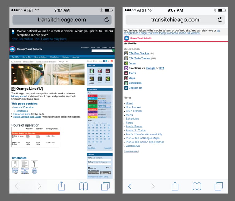
Putting users in control of their experience is generally good in principle, but prompting them to choose between your “full” site and your “mobile” site can create confusion. Your users have no way of knowing what they’ll find on this alternate site.
One way to put this into perspective is to translate the interaction into a physical-world equivalent. For example, imagine a scenario where a person intent on purchasing a new sweater walks into a clothing store and receives the following greeting from the store clerk: “Hi, thanks for coming in. I notice you are on the go. We have another store made for people like you. Would you prefer to shop there?”
Sounds obnoxious, right?! But that’s essentially what we’re saying when we offload the decision to select a site onto our visitors. Beyond not making a great first impression, it also puts the user in a conundrum, leaving them to speculate:
- “What’s the difference between the sites?”
- “Will I find the same content on both sites, or does one provide access to more useful or more in-depth information?”
- “Can I accomplish the same tasks in either place?”
This speculation about what one might expect to find or not find on a mobile site also correlates with observational data we’ve collected in usability research, where people verbalize their lack of confidence in finding what they are looking for when prompted to visit a “mobile version” of a site. The general user-assumption is that if there is both a desktop and mobile version of a site, the mobile version is the “lite” version, and useful content and functionality will be missing from it.
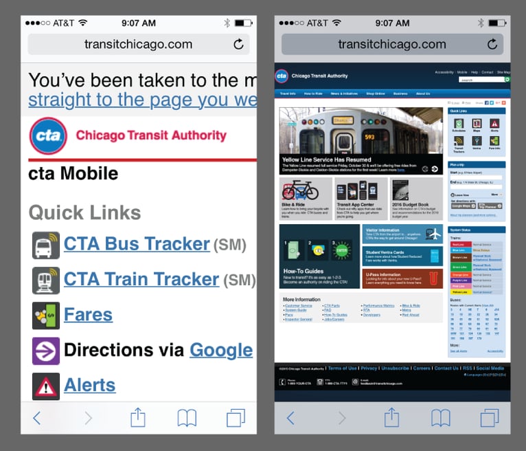
When Redirecting, direct users to the content they were looking for.
Let’s hop back to that sweater store analogy for a second. Imagine you’re that consumer on the hunt for a sweater and you’re walking down a busy street in the shopping district. You see the perfect winter sweater hanging on a mannequin in the window of a shop. The size looks right, and you can even see its affordable price tag. You walk into the shop, and surprise! The store does not look like the store. There is no mannequin. And of course, no mannequin means no sweater. Shopping fail! What happened here? You just got cat-fished by a mobile redirect.
A mobile redirect is a well-intentioned script that intercepts mobile visitors as they arrive on a site and routes them over to the mobile version. In cases where the mobile page loads quickly, is easy to use, and provides access to the same content and functionality as the “full site” counterpart, this can be an elegant optimization.
Sadly, it doesn’t always work out so well. Perhaps this sounds familiar: you search for something on Google and in the results you’re shown a page with content that appears to be an exact match. You click through optimistically, but are hijacked along the way and end up on some simplified mobile-site page with no trace of the information that was in your sights just moments ago.
It’s best to make certain that content is shared across every permutation of your site. And if you are going to use device detection to redirect your users (or allow them to switch between a mobile and full site), always route them to the equivalent page or content, don’t just drop them off on the home page.

Pinch and Zoom
For anyone who isn’t familiar with the terms, pinching refers to the fun (and delightfully natural) gesture of trying to squeeze together the surface of a flat piece of glass using only the pads of your index finger and thumb. On touch enabled devices, pinching usually shrinks the content on a web page. If you want to makes things larger, you zoom. To zoom you tap two fingers close together at the focal point of your screen. Then, be careful not to lift either finger from contact with the screen, you stretch them as far apart as possible in opposite directions.
Pinching and zooming is good because it enables people to adjust the size of things on screen to whatever they find most comfortable. It works great, except for people with arthritis. Or people trying to use a device with one hand. Or people wearing non-magic gloves. Or for people who want to read sentences of text without trying to pan horizontally all over the screen.
So, rule of thumb: never disable pinch and zoom, since it actually can make it easier for people to explore your content. However, the ability to pinch and zoom is no substitute for well planned design and fluid content that adapts gracefully to different screen sizes.
So, there you have it, a few tips on things to watch out for, and a few things to think about doing when optimizing for mobile.
Related Posts

3 Reasons Your Business Needs to Focus on Customer Experience
While there are many reasons why companies should focus on customer experience, here are three timely reasons that should be top of mind for any marketer.
![3 CMS Platform Migration Considerations [Mini Episode]](https://www.wearediagram.com/hubfs/Diagram-Views-Unfiltered-Transparent-BG-All-Black%20small.png)
3 CMS Platform Migration Considerations [Mini Episode]
Diagram's Chris Osterhout shares three essential tips that your organization should consider when moving to another CMS platform.
Results Matter.
We design creative digital solutions that grow your business, strengthen your brand and engage your audience. Our team blends creativity with insights, analytics and technology to deliver beauty, function, accessibility and most of all, ROI. Do you have a project you want to discuss?
Like what you read?
Subscribe to our blog "Diagram Views" for the latest trends in web design, inbound marketing and mobile strategy.
